
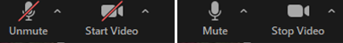
In a recent WebEx meeting with a client, I panicked thinking that I couldn’t turn my microphone on. I was supposed to give a 6-hour presentation — how was I going to do it if I couldn’t even unmute myself? I kept clicking the crossed-microphone icon, but the microphone stayed crossed whatever I did.
Here’s a screenshot:
In my panic, I was completely oblivious at the change in the icon color! Eventually, I discovered that, even though the microphone was crossed in both states, the red color of the icon was meant to signal that the button was active and I was muted.
I have seen users fall prey to this issue many times. The Mute button is used to switch between two system states (Muted and Unmuted), but the problem is that users cannot easily tell what the current state is and what they are switching to. (Also, contrary to best practices in icon design, in the WebEx implementation, there is no text label for the Mute button.)
Two Pieces of Information, Two Controls
In a situation where users can move between 2 possible states (let’s call them on and off for simplicity), there are two bits of information that are relevant to the user and, while related, are not identical:
- The current state of the system (on or off; in the microphone example, Muted or Unmuted)
- What will happen if the user presses the button — that is the next state, which could be off or on, depending on the current state (in the microphone example, Unmute or Mute)
An obvious way of implementing them would be to have two different UI elements: a state indicator and a change-state button. For example, in the Tesla app, the Controls screen takes this approach: you have both a state indicator to show you that the car is locked and an Unlock button. Tapping the state indicator does nothing, but tapping the control unlocks the car.

Two Pieces of Information, One Control
However, if you have a 2-state system, the current state and what will happen next are complementary. In other words, one may assume that the two pieces of information (state and what happens next) could be conveyed through a single control — a switch-state button. That’s because, if users knew one, (in theory at least) they could infer the other (if you know that your next state will be off then you can infer that the current one is on; or, if you know that your current state is on, you can infer that your next one is off).
However, remember that any type of inference takes time and cognitive effort, and often people are under the time pressure to respond quickly. If I am trying to unmute myself, everybody is either waiting for me or ignoring me and moving the conversation along, so I don’t have time to pause and think about the interface or make inferences.
Sometimes, however, the state can be easily determined based on other signals. For example, in a video player, there is just one control (the Play button) and it indicates future state. There are enough signals though to figure out that the video is playing — the user can hear the video or see the changes in the image on the screen.

If you decide to use a single control to indicate both state and what will happen next, how should that control be labeled?
There are two alternatives that could be considered in that situation:
- The button label communicates the state that the system will move to, should that button be pressed — that is, it tells the user what will happen next.
This is the standard recommendation for button design. Specifically, a site-registration button will be called Register and a submit button for an ecommerce checkout form will be called Purchase or Place order.
If a button is used to switch between two states, to follow this recommendation it should also change label, like in the Tesla example above or in the OBS example below.

OBS Studio: The button for Start Recording follows the classic naming recommendation and switches label to Stop Recording once the recording has started. If there is no text label (presumably because the icon is clear enough), then the icon should change depending on the state it moves the system to. A classic example is the interplay between the Play and Pause icons seen in the YouTube example above and present in most video players.
2. The button communicates the active state using a shadow. This is what used to happen in real life to on/off type of buttons: when you pressed them, they did not change label, but “sunk down.” In UI design, to capture that metaphor, designers usually add a shadow to indicate that the button has been pressed and now it’s active.

In Word, the icon for B for Bold (left) acquires a shadow when selected (right) to indicate that you are in bold mode (not normal). In this implementation, the button does not change label as the user presses it. Understanding this design clearly depends on the shadow being recognizable as a signifier for active state. This design should NOT rely on the user remembering the color of the button in its two states and knowing which color stands for active — in order for it to work, it should be absolutely evident that the active state is a pressed button, a feat that is sometimes hard to achieve in a flat-design world.
Let’s go back to the WebEx example. In retrospect, we can see that WebEx used a single control to indicate both the current state and what will happen next and implemented the second design solution — signaling active state. Unfortunately, the red color as a signifier for active state was a poor design choice for several reasons:
- Red is used arbitrarily in the interface — for example, the X (Leave) button is also red, and it cannot mean that it’s active. (If red represented active state, what would a red X mean? That I’ve left the meeting already?)
- A different color (blue) is used to indicate active state for other buttons such as Video and Chat (i.e., the blue video icon signals that video is on).
In the absence of a clear indicator of active state, the user is left to rely on the button label to decide what’s happening and, with the icon label unchanged, that will simply cause confusion.
By the way, The Phone app on the iPhone uses the same implementation — the only difference is that it is more consistent than WebEx and deploys a white fill to indicate active state. Even with those adjustments, it’s hard to infer the active state of a button.

Recommendations
So, what is the overall recommendation for state switching buttons that double as state indicators? The safest solution is to use 2 UI elements, one for current state and another one for the switch-state action, like in the Tesla example.
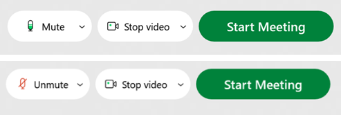
If you want, you can combine the two in a single control like Zoom does. Its Mute control has two separate components:
- A text label indicating what will happen if the user will tap on that control
- An icon indicating the current system state
Clicking on either will change the state.
A newer version of WebEx has moved to the same design.
Remember, your goal with an on–off control is to make sure that users quickly understand both:
- The current state, and
- What will happen if they press that control
Assess the two states that the system will go through.
- Is it obvious what the two opposite states are?
- If no, then that speaks in favor of the 2-control design: one for the current state and one for the action to move to the other state.
- If yes (perhaps because there are strong conventions and a standardized design), you can consider a single design element that simply says what the command will do.
- Are there external cues (e.g., noises, visual changes in the environment) that could help users determine the current state?
- If no, then use the 2-control design, with a state indicator (to clearly convey the current state) and a button to switch state.
- If yes, then you can consider a single design element — a state-switch button.
- Will users need to quickly determine state and change it (like in the case of the Mute button)?
- If yes, then simply have an icon to indicate state and a button for changing it.
- If no, you can consider a state-switch button.

