
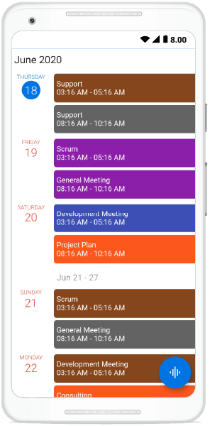
The schedule view is a discrete view integrated into our Calendar widget that shows a list of scheduled appointments grouped by week, between minimum and maximum dates. This feature is available in our 2020 Volume 2 release.
Through this feature, you can display a list of appointments along with day, week, and month headers. You can assign unique styles to the available headers. This rich feature set includes customization, globalization, and localization.
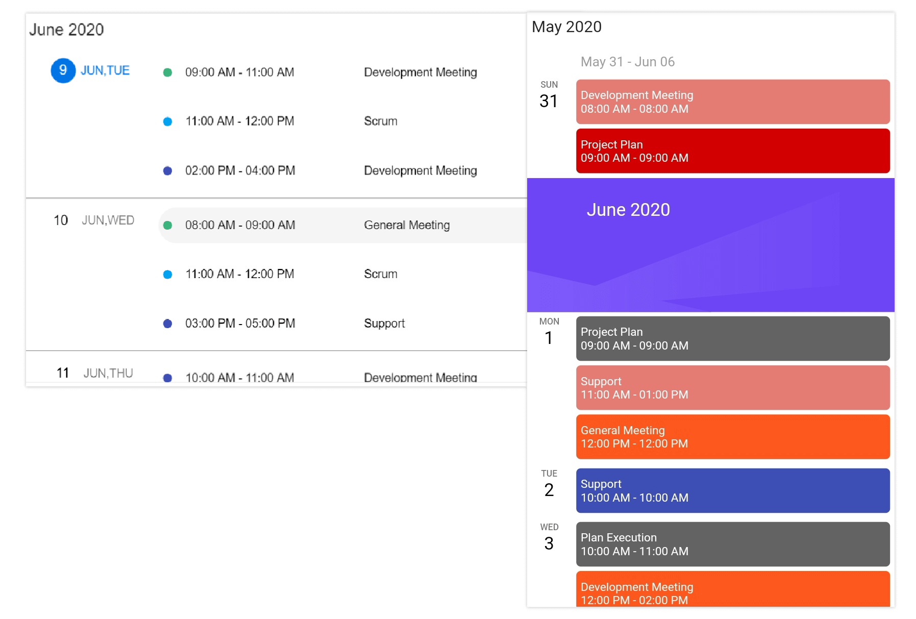
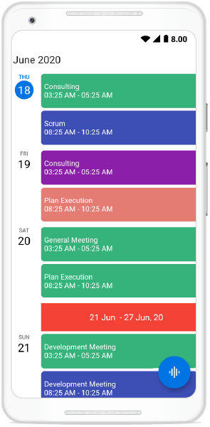
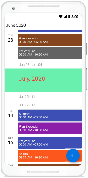
The schedule view has two different UIs. They are:
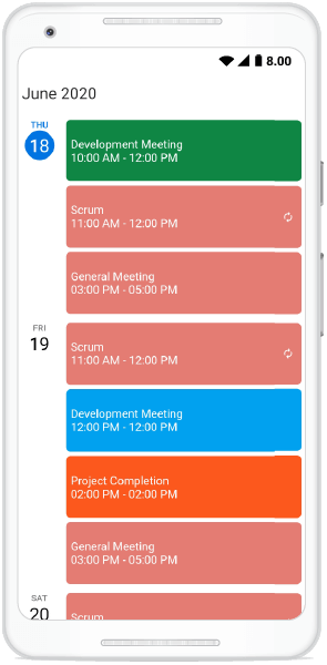
- Mobile: Displays the month, week, and date header.
- Web: Displays the appointments alone.
In this blog post, I will explain the key features of the schedule view in the Calendar widget. If you are new to the Calendar widget, please go through the Getting Started article in the Calendar documentation before proceeding.
Let’s explore!
Appointment item height
You can customize the height of an appointment in the schedule view by setting an appropriate value to the appointmentItemHeight property from the ScheduleViewSettings of the Calendar widget.
Refer to the following code example.
@override
  Widget build(BuildContext context) {
    return Container(
      child: SfCalendar(
        view: CalendarView.schedule,
        scheduleViewSettings: ScheduleViewSettings(
          appointmentItemHeight: 70,
        ),
      ),
    );
  }
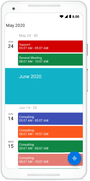
Hide empty weeks
You can hide the weeks that don’t have any appointments in them in the schedule view by setting the value true to the hideEmptyScheduleWeek property available in the scheduleViewSettings .
Refer to the following code example.
@override
  Widget build(BuildContext context) {
    return Container(
      child: SfCalendar(
        view: CalendarView.schedule,
        scheduleViewSettings: ScheduleViewSettings(
          hideEmptyScheduleWeek: true,
        ),
      ),
    );
  }
Customization
To provide a uniform and consistent look, the schedule view allows you to customize all its headers, appointment text style, and date and day formats.
Let’s see them with an appropriate code example!
Appointment text customization
The appointment text style of the schedule view can be customized by setting the appropriate text style to the appointmentTextStyle property available in scheduleViewSettings.
Refer the following code example.
@override
  Widget build(BuildContext context) {
    return Container(
      child: SfCalendar(
        view: CalendarView.schedule,
        scheduleViewSettings: ScheduleViewSettings(
            appointmentTextStyle: TextStyle(
                fontSize: 12, fontWeight: FontWeight.w500, color: Colors.lime)),
      ),
    );
  }
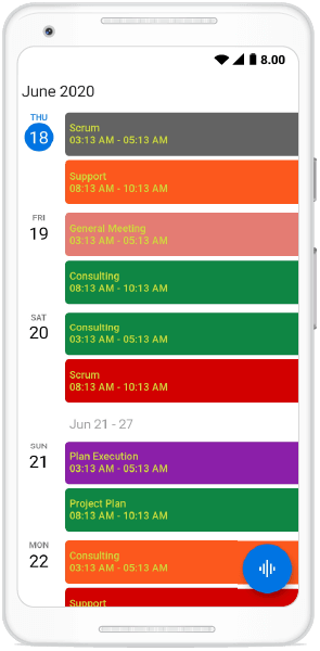
Day header customization
The day header is the one that displays the date and day of the appointments on the left side of the view. This will be displayed only when the date has an appointment on it.
To provide a consistent look and format, you can customize the day header using the properties available in the dayHeaderSettings property available in the scheduleViewSettings.
The DayHeaderSettings class contains the properties that allow you to customize the features. This can be done by setting appropriate values to the dayFormat, width, dayTextStyle, and dateTextStyle in DayHeaderSettings.
Refer to the following code example.
@override
  Widget build(BuildContext context) {
    return Container(
      child: SfCalendar(
        view: CalendarView.schedule,
        scheduleViewSettings: ScheduleViewSettings(
            dayHeaderSettings: DayHeaderSettings(
                dayFormat: 'EEEE',
                width: 70,
                dayTextStyle: TextStyle(
                  fontSize: 10,
                  fontWeight: FontWeight.w300,
                  color: Colors.red,
                ),
                dateTextStyle: TextStyle(
                  fontSize: 20,
                  fontWeight: FontWeight.w300,
                  color: Colors.red,
                ))),
      ),
    );
  }
Week header customization
The week header is the one that displays the first and last date of the week at the start of a week in the schedule view.
To provide a consistent look and format, you can customize the week header using the properties available in the weekHeaderSettings property in the scheduleViewSettings. This can be done by setting appropriate values to the startDateFormat, endDateFormat, height, textAlign, backgroundColor, and weekTextStyle of WeekHeaderSettings.
Refer to the following code example.
@override
  Widget build(BuildContext context) {
    return Container(
      child: SfCalendar(
        view: CalendarView.schedule,
        scheduleViewSettings: ScheduleViewSettings(
            weekHeaderSettings: WeekHeaderSettings(
                startDateFormat: 'dd MMM ',
                endDateFormat: 'dd MMM, yy',
                height: 50,
                textAlign: TextAlign.center,
                backgroundColor: Colors.red,
                weekTextStyle: TextStyle(
                  color: Colors.white,
                  fontWeight: FontWeight.w400,
                  fontSize: 15,
                ))),
      ),
    );
  }
Month header customization
A month header is the one that displays the month and year at the start of a new month in the schedule view.
To provide a consistent look and feel, you can customize the month header through the properties available in the monthHeaderSettings property available in the scheduleViewSettings. This can be done by setting appropriate value to the monthFormat, height, textAlign, backgroundColor, and monthTextStyle of MonthHeaderSettings.
Refer to the following code example.
@override
  Widget build(BuildContext context) {
    return Container(
      child: SfCalendar(
        view: CalendarView.schedule,
        scheduleViewSettings: ScheduleViewSettings(
            monthHeaderSettings: MonthHeaderSettings(
                monthFormat: 'MMMM, yyyy',
                height: 100,
                textAlign: TextAlign.left,
                backgroundColor: Colors.green,
                monthTextStyle: TextStyle(
                    color: Colors.red,
                    fontSize: 25,
                    fontWeight: FontWeight.w400))),
      ),
    );
  }
Conclusion
In this blog post, we had a quick overview of the key features of the newly introduced schedule view in the Flutter Calendar. This feature is available from the Essential Studio 2020 Volume 2 release onwards. Enjoy these user-friendly, custom features and elegantly schedule your appointments.
You can explore other features in the Calendar widget’s documentation, where you can find detailed explanations of each feature with code examples.
Please feel free to try out the samples available in our GitHub location, and share your feedback or ask questions in the comments section. You can also contact us through our support forum, Direct-Trac, or feedback portal. We are always happy to assist you.


Related Blogs
If you liked this article, then we think you would also like the following articles:


Comments (4)
Is it possible to have a multiple lines appointment text (maxLines parameter inside Appointment class)? If not, will it be added in further updates? Also, it will be useful to have an overflow parameter.
Hi @Adilet,
As of now, we don’t have support for multiple lines support in ScheduleView appointments. We have planned to provide a custom widget for this appointment widget. So that you can add your own widget instead of this default appointment widget. It will be available on or before vol 4, 2020 release which is expected by the end of December.
Can we disable swipe action that changes dates in scheduleview.day
Hi Ankit,
Based on the provided information, we have checked and your requirement to `Enable/Disable the swiping interaction in the Flutter calendar`. We have already logged the feature request for the same. We will implement this feature in our upcoming 2021 Volume 1 release, which is expected to be rolled out by mid of March 2021. We appreciate your patience until then.
Now you can track the current status of this feature request by using the below feedback link.
Feedback link: https://www.syncfusion.com/feedback/20195/providing-a-support-for-enable-disable-swiping-interaction-in-the-flutter-event
Comments are closed.