Avoiding Bad Practices in iOS and Android Design
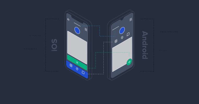
In an era of cross-platform mobile development, it is crucial to understand the specifics of different operating systems and hardware.
In this article, Mobile Developer Martin Doychev lists a number of bad practices employed while creating apps for iOS and Android and explains what you should and shouldn’t do.

Martin is a mobile developer and teacher, with ample experience in many languages and frameworks. As of late, he is focused on React Native.
How many average people have you seen using both iOS and Android devices at the same time? The official numbers according to this study range between 10% and 20%, but the figure includes Mac users as well, not just mobile users. In practice, people tend to use just one phone or tablet over a given period of time. If they happen to be using two devices, more often than not, both will be running the same OS.
What this means is that there is no need to make pixel-perfect copies of an app’s UI design, trying to accommodate both platforms, complete with tens of different screen sizes, aspect ratios, and resolutions (let’s not even bring up notches, status bars, navigation bars, hardware buttons, etc.).
On the contrary, even if a user is looking at the same app on both iOS and Android, chances are they would prefer to experience the native feeling on both of them. This is why the approach taken by many project managers and product owners in mobile development is often suboptimal and needs to be fine-tuned.
Why is This Still a Problem?
But why are stakeholders and managers still making decisions that frequently degrade user experience, thus undermining their own products? It was understandable at the start of the decade when everyone was still getting to grips with iOS and Android development, yet this annoying problem persists to this day.
The main reason for this situation coming up could be the concern expressed by project managers and mobile developers that their users might get confused if they see the same app on another platform, and realize that it doesn’t provide the exact same feeling and UI. It is fair to say that to a certain extent, this line of thought makes sense, as some degree of similarity is necessary and welcome. However, taking it too far and, in extreme cases, making exact clones of apps for different platforms actually tends to do a lot more harm than good.
The ultimate goal should be to strike the right balance—don’t force pixel-perfect consistency, but stick to common design ideas and keep the navigation map of your app similar for both platforms; provide the same features and the same workflow, but try to stick to native behavior wherever possible.
Everyone loves a custom button or fancy animation here and there, but native elements are what people are used to and find easier and more intuitive to use.
Focus on Users, Not Appearance
In order to find a good approach to address this dilemma, we should start from the end of the line—the end user. Research tells us that Android and iPhone users are very different people and if we are targeting optimal UX, we should try to get into their usage patterns.
Starting from the average budget people decide to spend on tech per month (iPhone: $100.88, Android: $50.83), passing by the number of selfies they make per day iPhone: 12, Android: 7 and getting to the texts they send every day iPhone: 57, Android: 26, it’s easy to spot that differences are substantial, to the point that we can conclude there exists a divergence in the behavior, which drives the way people use their devices.
So, what should we focus on when designing applications for both platforms at the same time?
First of all, go for native elements where possible. Even if you are using a cross-platform framework, most of the components are based on pure native views; so unless you really need something custom—stick to the basics. People like using what they are used to and you will save some developing time for more important features (and code reviews!).
Custom views can definitely bring character and uniqueness in your app, as long as they keep the same general ideas and usage feeling like the generic ones—too little and your app is boring, too much and it’s unnecessarily flashy and hard to use.
Sometimes, even a small touch with a slightly different custom view can be a game-changer for your app, but if you fill all screens with new elements for the users to explore, they might become overwhelmed and get lost while looking for important information. It’s no coincidence these small touches are called “polish!”
How to Approach Different Design Components
As a rule of thumb, always remember that each platform has its own design guidelines. Android’s set of approaches is stepping on Material Design, while Apple trusts Human Interface Design. Getting into the specific components we should consider when planning our design, there are several main parts to focus on:
-
General style: unless we are talking about a cross-platform application, we should consider following the general style guidelines for each platform. Overall, iOS designs tend to be flatter, while Android goes for a more layered approach.
Historically speaking, mobile platforms have been influencing each other for a decade or more, and you can easily spot some Android concepts in iOS and vice-versa. For example, when fingerprint sensors started appearing in the mobile world, manufacturers were (and still are) experimenting with the size and location of the sensor, trying to make it comfortable for as many users as possible. At the same time, designers and developers were adapting to the new feature as well, so in the end, visual elements and feedback are mostly identical across both platforms (save for some exotic approaches).
-
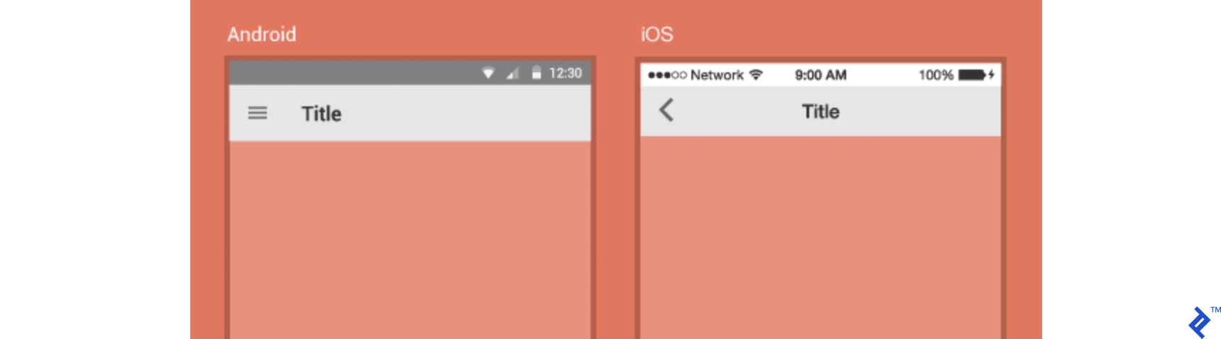
Hardware specifics and navigation patterns: this is probably one of the most striking examples of the negatives of outright cloning your app. Most Android devices still have the comfort of an additional navigation bar (whether hardware or software on different devices), including a back button. Since iOS doesn't provide that, applications have to consider where and when to provide the back button, usually in the top left corner of every screen.
The menu button (the square button in this example) can also provide additional functionality for Android apps. Where is this relevant? For example, when opening the settings menu or a similar navigation feature.

Until recently, iPhones featured Apple's traditional Home button too, but since the introduction of iPhone X, it has been sidelined and the flow in iOS is now based on gestures. If swiping is an important part of your app, make sure to give enough cushion between the edge of the app container and the swiping area you allow to avoid tricky swipe coincidences.
In case your app relies on hardware-specific functionality such as Bluetooth, NFC, or wired headphones, you should always consider the range of different hardware specifications you are supporting. Try to provide proper feedback to the user when they try to interact with a specific feature. If for some reason you need to provide a hardware-specific feature for only one of the two platforms, make sure to inform your users about the difference.
-
Global elements (status bars, headers, etc.): components that appear on all pages of your design, like the status bar, the navigational header and so on, should be strictly aiming to deliver a native feeling, so we shouldn't change the height and style of those bars. There are minor differences in how the global elements are styled on both platforms. For example, Android uses left-aligned text while iOS goes for a centered title. The status bar is a native component so you don't need to worry about it, but keep in mind different notches and screen aspect ratios when planning the top section of your app.
-
Navigation: Google's good old Material Design guidelines suggest going for drawer menu navigation in Android applications, with bottom navigation coming behind, but still being a viable option. iOS tends to go solely for a tab bar, which may limit your top-level navigation options but provides a clear view of all of them at once. In this case, both operating systems provide similar components that can be used depending on the complexity of your app, but the visual difference in the two systems should naturally direct you—for example, the global navigation bar in Android and its lack in iOS.
The rapid evolution of mobile hardware in recent years has introduced many variables and unknowns: all-screen phones, notches of different shapes and sizes, increased use of gestures for device-wide navigation and so on. All those changes provide unprecedented power to the user but can be a pain when we are trying to figure out all use-cases of a given screen in our app. Given these concerns, a good approach to avoid confusion for our users would be to keep navigation patterns simple and consistent, without overloading the app with too many gestures, bars, and multi-direction swiping options.
-
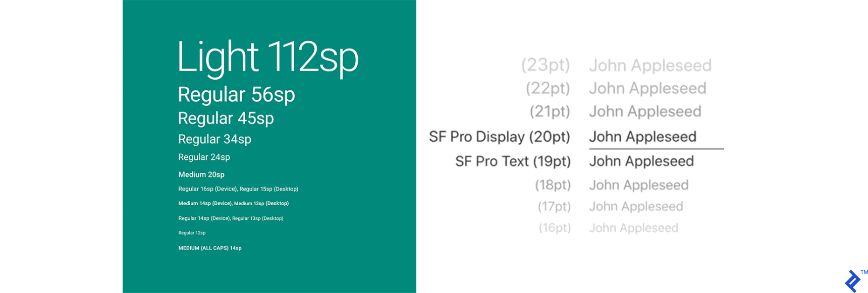
Typography: both platforms have their default typefaces—San Francisco for iOS and Roboto for Android. Unless you are going for a custom font, tightly matched with your general app style, you should stick to the defaults. Keep in mind users might change their default system font and this will not affect any views which you have customized with a specific typeface.
For example, dyslexic users might not have the best time in your app if they have replaced the default font with a font that specifically meets their needs. If you are supporting users who might be using non-Latin fonts (like Cyrillic, Arabic, etc.), make sure that your custom fonts are providing those extra characters as well. If you're into gaming, you probably saw those leaderboards with high scores achieved by Russian players whose names stand out due to their different font. This just a minor mistake made during the development phase, not a "feature" for specific players, and while it probably won't make users ditch your app, it can definitely result in degraded user experience or result in complaints or poor reviews.
Other components: buttons, screen transitions, animations, micro-interactions, action sheets, alerts, and all other types of flow controls are beyond the scope of this article, but they should follow the general principle we applied to other design elements so far—both platforms discourage excessive custom elements, as they might distract and confuse the user; when it comes to design, the first impression is usually the last for many users and that's why it's so important to attract users' attention from the start, and make them feel at home, so to speak.


In the real world, you can see some very popular exceptions to the rules we discussed—iOS applications which follow the Material Design guidelines and some Android products going for Apple’s Human Interface guidelines, but those apps have their own, proven style. Users are familiar with the apps and their design, and for them, it makes sense to provide a slightly more custom feeling.
Cross-Platform Approach Done Right
On the other hand, if your project is based on a cross-platform solution (like React Native, Flutter, Xamarin, etc.), you should consider what would be the primary platform you want to focus on and start from there.
In recent years, these new frameworks have provided massive productivity improvements in cross-platform application development. More and more companies are switching to this development paradigm, as it provides a shorter time to market, superior cost-effectiveness, and fewer technical barriers, with the key downsides being limited feature support and suboptimal UX in some cases.
While virtually all older solutions for cross-platform development were based on web views and therefore experienced serious problems with responsiveness on many devices, nowadays we can use native components even in cross-platform approaches. This major improvement has affected the market in many ways and has brought all mobile platforms one step closer towards unifying the user visual experience on various devices and platforms.
If you decide to go for a cross-platform solution, you can start as in a standard native app by building the skeleton of your app. Once you have your main priorities up and running (setting up base dependencies, building an MVP, reaching project-specific milestones, releasing your first version, etc.), you can easily separate your main designs for the two applications, using the platform-specific tools that each framework provides. Depending on the size of your team and the time frame available, you could even consider including those tweaks in version 1, just to avoid future confusion when things don’t look the same anymore in a given platform version.
After all is said and done, you should evaluate which of those principles will be valid for your app. Like in almost any endeavor in our industry, you should try to follow the guidelines, while slightly adjusting them to fit your specific needs. For example, if drawer navigation is what really makes sense for your simple five-screen app, then you don’t need to come up with complicated solutions for each platform. Make it obvious and easy for the user to recognize your custom buttons and tools, whether they are key components or just minor customizations.
Good Design Respects User Habits
To summarize, we can repeat something we already know—good design is the design that respects users’ habits in each operating system. Just a little polish at the end might make the difference between an average and a great app.
Many times, your app will not provide enough unique features to win users over with content alone. Most people will describe their decision to choose one product over another with “a gut feeling.” This category of users base their choices primarily on how they feel when using the app by implicitly evaluating the responsiveness, general style choice, color palette and individual visual components they see on the screen.
Therefore, try to make sure your product stands out not only by virtue of its amazing features but with high-grade packaging to match the quality of the services it provides.
Further Reading on the Toptal Blog:
Understanding the basics
Is iOS more user-friendly than Android?
It is a matter of personal preference. Some users prefer the simplicity of Apple’s features, others appreciate the customization options and personal-tailored experience in Android.
Is Android or iOS development easier?
Android is developed mostly done in Java (and Kotlin), and since it is a more popular language—one could argue that Android is easier to develop. On top of that, the Play Store is easier to use than the App Store. Plus, it’s free.
What is the difference between iOS and Android development?
The development process is very similar for both (if not identical), but other than the languages and environment used in everyday life, we could say that Android is more accessible and available for development on more devices.
Which framework is best for mobile app development?
It really depends on what the project is aiming to do; you might get different answers if you ask different people, but an excess of choice only means that the field is growing and evolving in a good direction.
Which framework is best for hybrid app development?
Currently, there are a few main competitors in the cross-platform frameworks field. All of them have different minor pros and cons to discuss but React Native seems like the platform which combines the most important factors—good performance and an active community.
Sofia, Bulgaria
Member since May 13, 2019
About the author
Martin is a mobile developer and teacher, with ample experience in many languages and frameworks. As of late, he is focused on React Native.