Which Is Best: A Loyalty Program PWA Or Mobile App?

Email Newsletter
Weekly tips on front-end & UX.
Trusted by 200,000+ folks.
 Register!
 Flexible CMS. Headless & API 1st


Customer loyalty is a critical component in the success of any business. In some cases, loyalty can be earned by providing a high-quality service and dedicated support. In other cases, customers expect more from a business than just the products or services they put before them.
So, don’t be surprised when clients ask you to design a loyalty app for them.
Loyalty programs are a great way to dish out rewards to the most loyal base of customers while also giving them a reason to stay engaged with a brand. This isn’t superficial engagement like views or clicks either. If the rewards are valuable enough, customers will stay committed to a business for longer (even when faced with a negative experience) and also spend more money than one-time customers.
There’s a lot of value in creating a loyalty program. Now, it’s up to you to determine the best way to design it for your clients:
Should it be a PWA or mobile app?
Why Is Mobile The Key To Loyalty?
Using the 2018 Loyalty Program Consumer Survey from CodeBroker, let’s shed some light on why mobile is where you need to design your clients’ loyalty apps.
To start, there are a number of businesses that would benefit from loyalty programs. For example:
- Retailers
- e-Commerce
- Restaurants
- Hotels
- Airlines and other travel providers
- Credit card companies
With many of these options, there’s an in-person component at play, which is why it’s important to give users access to their loyalty program and rewards on mobile.
But be careful. Of the top concerns expressed by CodeBroker’s survey respondents, 54% said it was too difficult to access rewards information from their mobile devices.
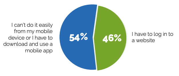
What’s more, many consumers were frustrated with having to install a mobile app in order to get rewards updates. And, yet, 75% indicated they’d be more likely to sign up for a rewards program if it were convenient to use from their mobile device.
Now, the main gripe from this report is that consumers want communications about rewards points and other program details sent via text and email. They don’t want to have to log into a mobile app to get them.
It’s a valid argument to make. If a brand were proactive in emailing Jane Doe to say, “Hey! You have 2,500 points to use by the end of the month!”, that would be a much better experience than Jane Doe having to take the initiative to check on her points standing.
“
True customer loyalty comes about when brands can anticipate their customers’ needs and provide a more personalized, fast and convenient experience.
Which is why we have to look beyond mobile communications and look at how to actually design the program’s experience for mobile.
Designing Loyalty Programs For Mobile
While mobile apps and PWAs can both provide a good experience, consumers have already expressed a disinterest in installing mobile apps to manage their loyalty programs. That said, I don’t think it’s fair to throw native mobile apps out of the race solely based on that feedback. If you make a mobile app worthwhile, consumers will use it.
Plus, PWAs can work offline… but will only display cached content. Which means that customers who want to use their loyalty app to place orders on the go, pay in store from their app or do something else when they’re out of service range won’t be able to do so with a PWA.
That’s why I’m going to argue that you should design your loyalty program as a PWA only if there’s no in-person counterpart. So, basically, e-commerce companies can skip the mobile app. Those in the credit card space might be able to get away with it, too, though security will need to be extra tight.
Everyone else, will need to build a mobile app. And, based on what I’m seeing, you should create a matching PWA, too.
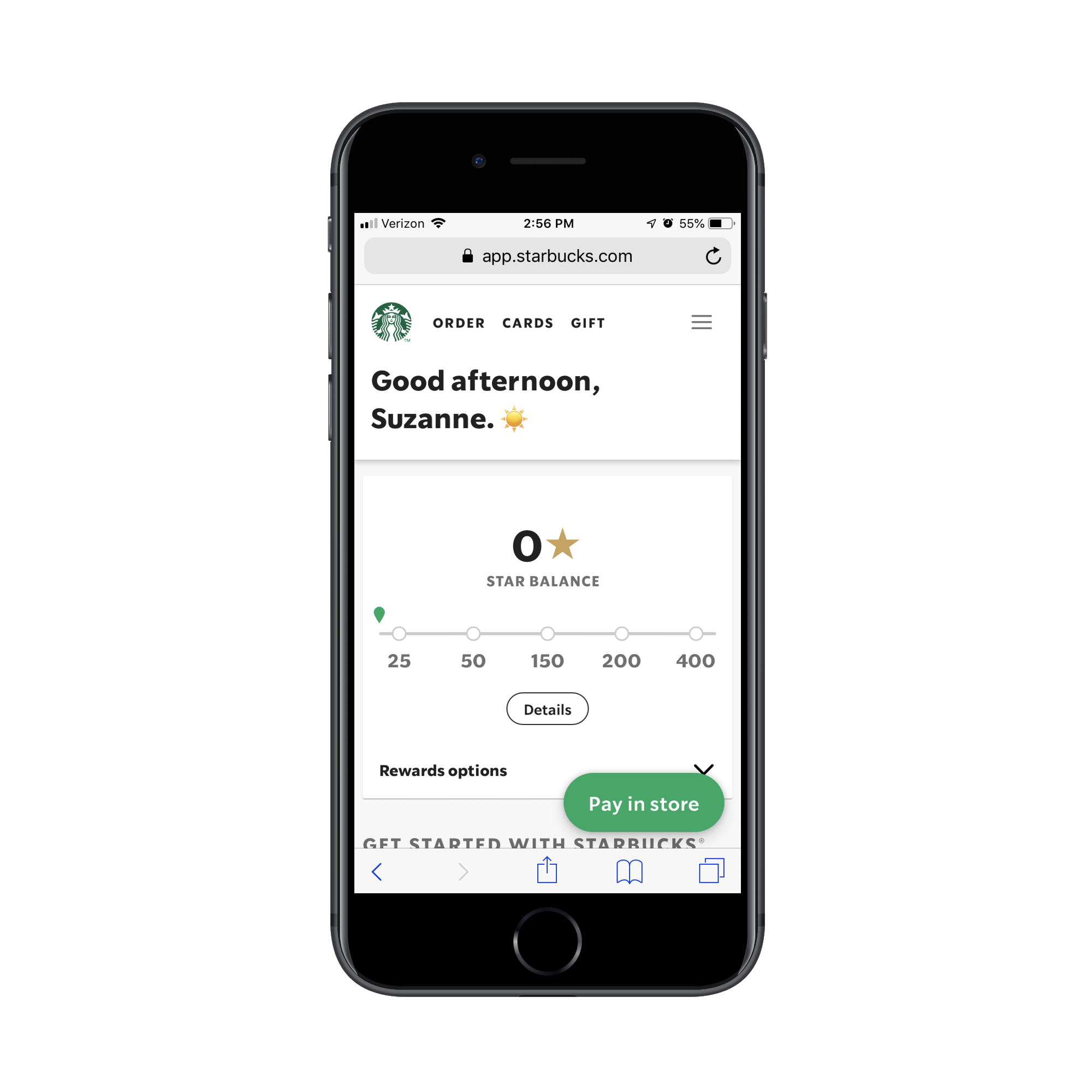
For example, this is the Starbucks rewards app as a PWA:
And this is the Starbucks loyalty program as a mobile app:
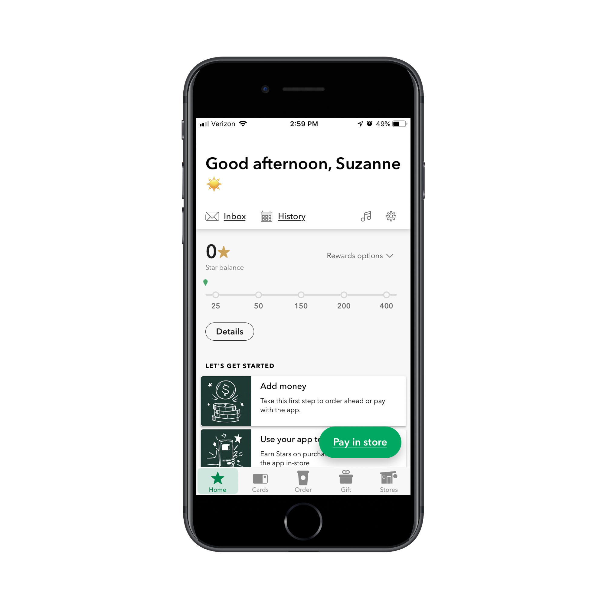
There are a number of discrepancies between the two, but, for the most part, it’s an identical experience. I’d even argue that the PWA looks a lot cleaner and more welcoming to users. However, the mobile app is necessary for customers that want to order while they’re on the road or to pay from their phone at the counter or drive-through.
With that out of the way, I’d like to quickly review some strategies for designing loyalty program apps for your mobile users. I’ll use both PWAs and native apps in these examples, just so you can see that there isn’t a whole lot of difference in how you design them:
1. Ask Your Users for More Than a Username and Password
Unlike something like an email subscription form or a free SaaS signup, you should be collecting more than just a username and password from your users. And they should be happy to give it to you.
It’s up to you to decide where and when it’s best to ask for this information though:
Do you want to ask for it on the login screen? Or do you want them to provide personal details and preferences later on?
Let’s look at how The North Face’s VIPeak program handles it:
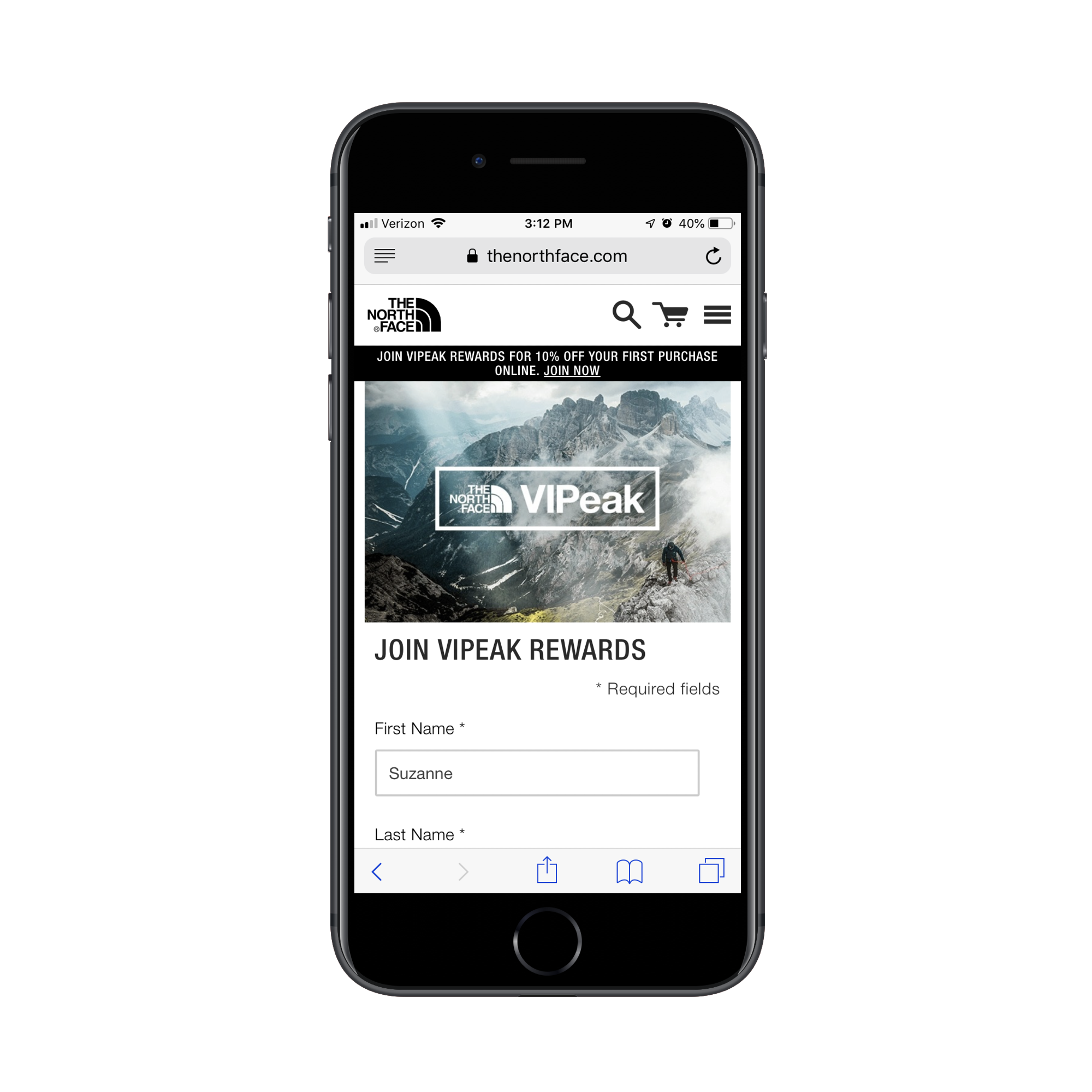
This signup screen asks for four things:
- First Name
- Last Name
- Password
It’s a couple extra fields to fill in, but I don’t think many customers will take issue with it. Plus, signing up doesn’t just let them start collecting rewards immediately. They automatically get 10% off their first purchase from the website.
Now, what I like about how this one is handled is that users aren’t pestered with extra questions at signup. Instead, they have the ability to customize what sort of promotions they receive at a time when it’s more convenient for them.
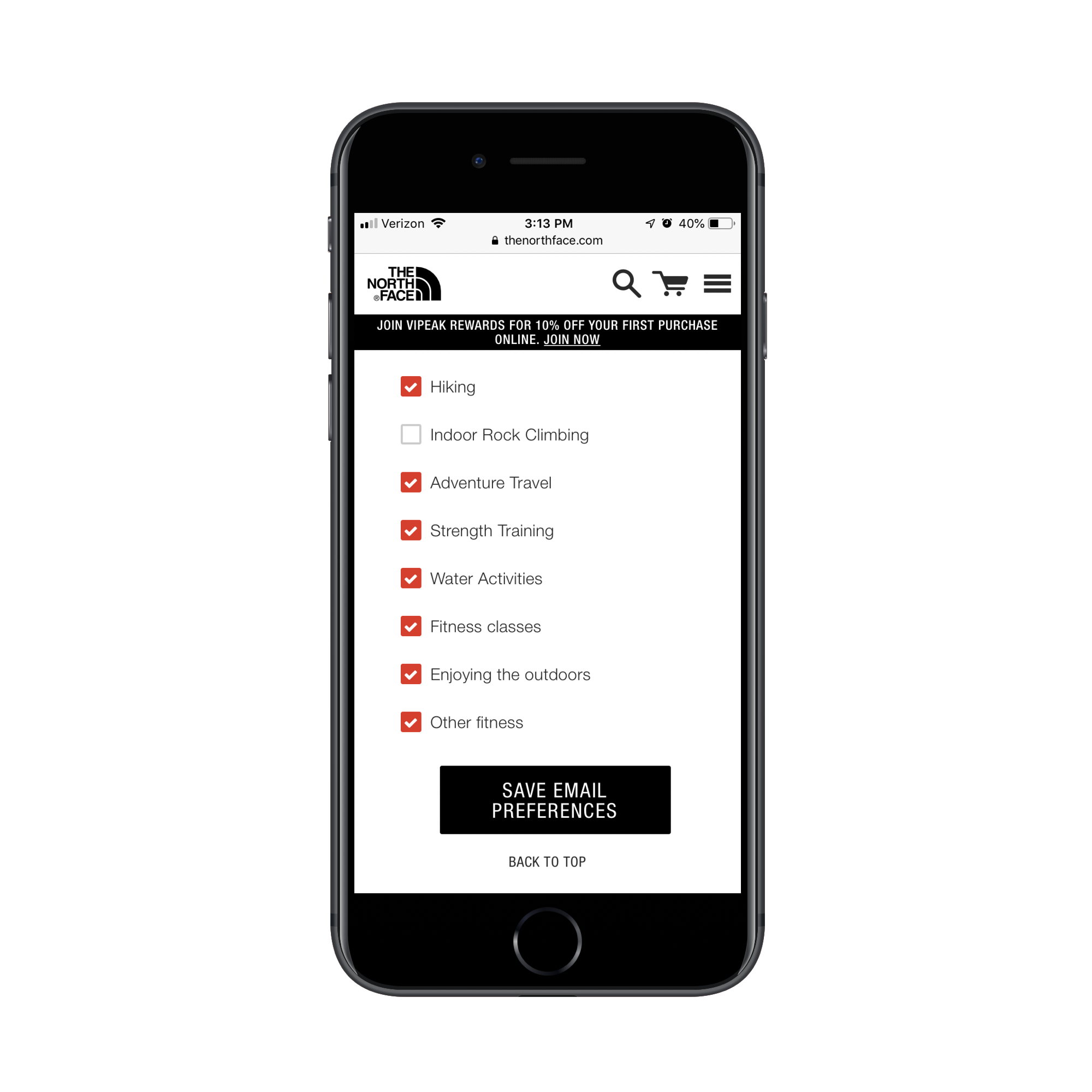
This is just one way to make the signup process go more smoothly on mobile. You can use this post-signup customization for more than just email preferences, too. You can plant a number of additional fields or questions in their account settings.
For instance, you could ask for their mailing address if the loyalty app also does order-and-delivery services. Or if you want to go old school with your marketing and send them a mailer.
You could also ask for their birthday. This would work in your favor two-fold. First, a birthday discount or free gift offer is a great way to re-engage a user who’s potentially lost interest or forgotten about the brand. Plus, everyone loves a birthday gift, so that “free” bonus would be useful in holding onto their loyalty.
2. Always Lead with Points
There’s a reason why the CodeBroker report focuses heavily on the points aspect of loyalty programs.
“
So, when you design your loyalty PWA or mobile app, don’t be coy with that data. Put it front and center.
This is the Chick-fil-A One app:
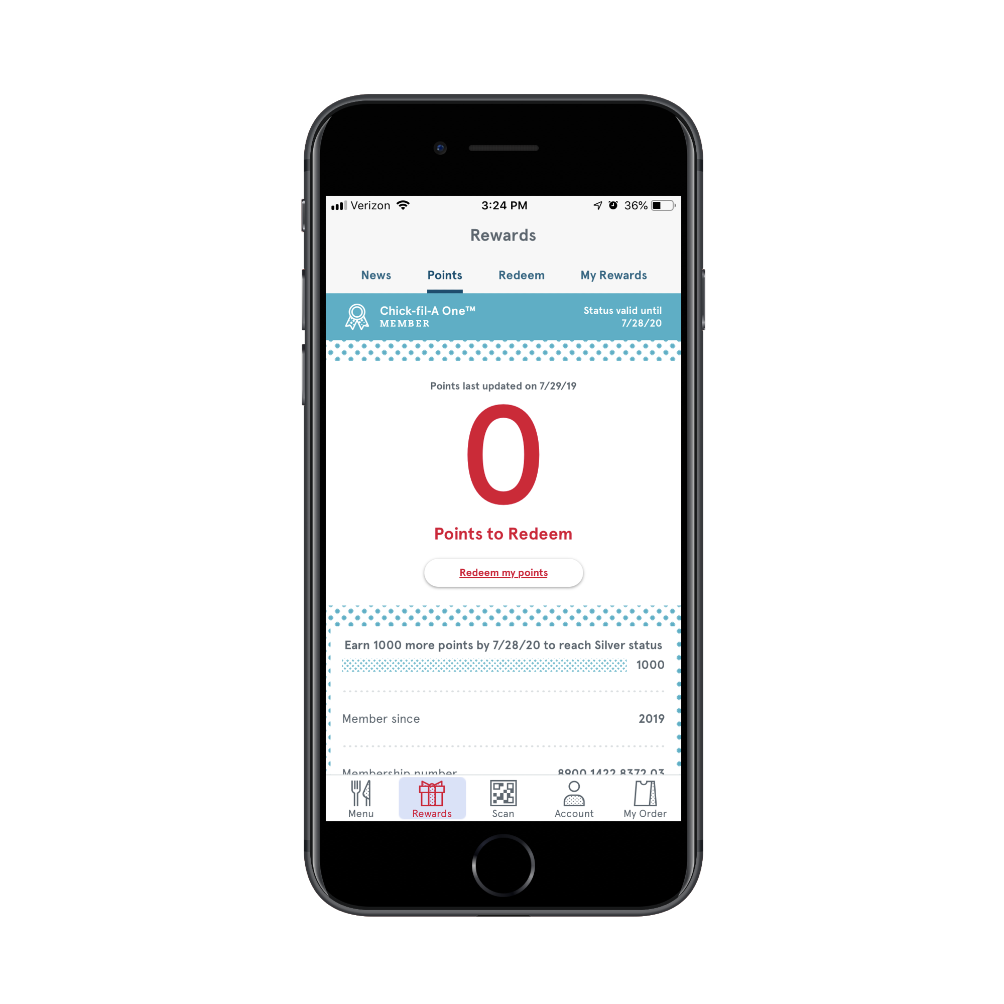
As you can see, the main focus in the “Rewards” tab is on how many points are available to redeem.
This is a good idea for two reasons:
- If someone comes to the app wanting to spend their points, there’s no need to hunt them down. This makes the experience better for them and speeds up the time to conversion.
- If someone comes to the app to do something else, that big red number might be enough to get them thinking, “Hmmm… maybe I should deal with those points while I’m here.”
Either way, the prioritization of points available gives them a reason to re-engage and spend.
Plus, it’s really easy to redeem available points.
If users click the “Redeem my points” button under their points counter or they click on the “Redeem” tab at the top, they’ll be taken to this page:
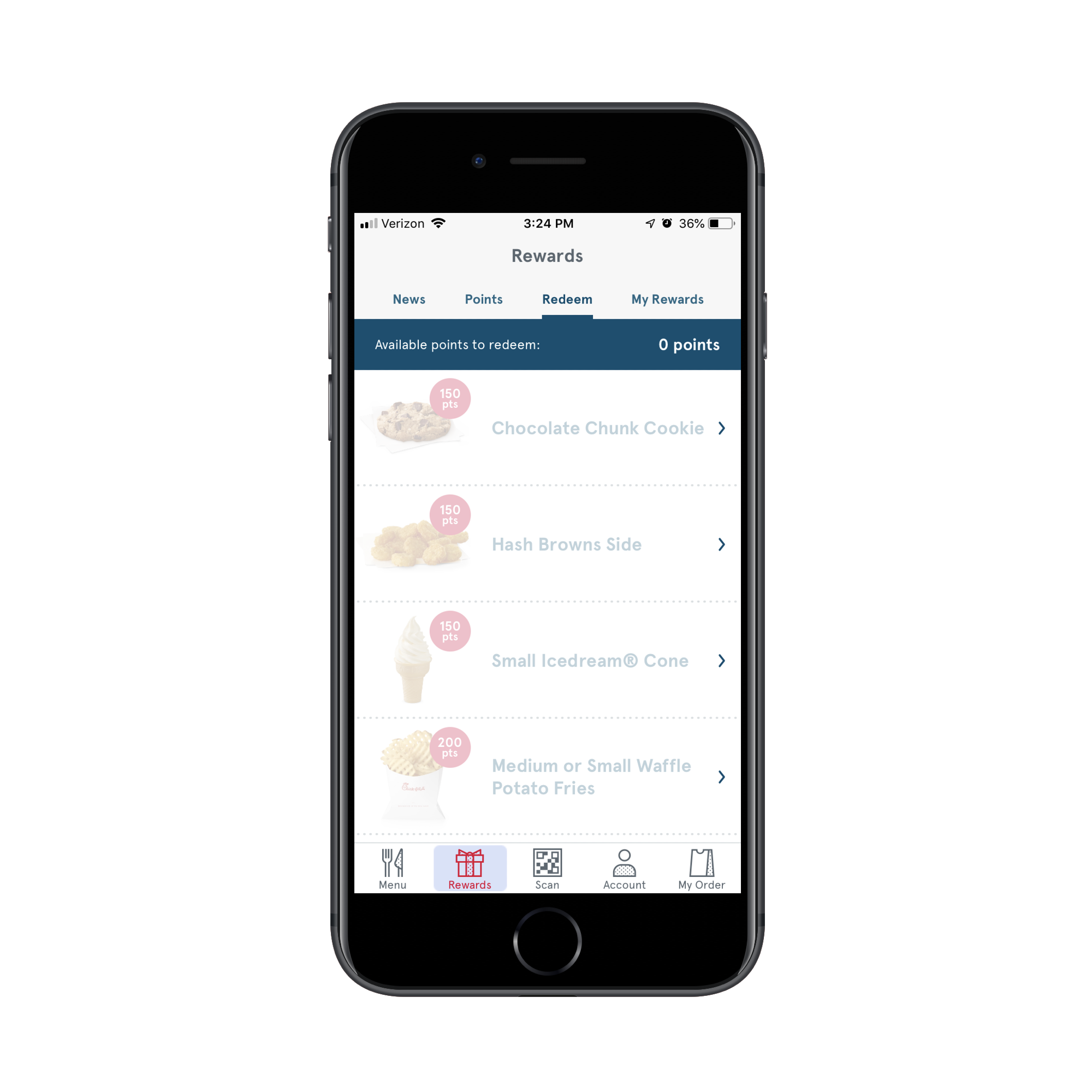
Items that are unavailable (based on the user’s point total) will be greyed out. The ones they do have enough points to spend on will appear in full color.
It’s a smart design strategy as it simplifies the redemption process while also motivating users to open their wallets and spent a little more to get the items they can’t afford with points just yet.
3. Motivate Them to Spend More By Using FOMO
Feature comparison tables aren’t just a great way to upsell product tiers to customers. You can use them to communicate the value of spending more money through a loyalty program.
Sephora’s Beauty Insider program uses this technique:
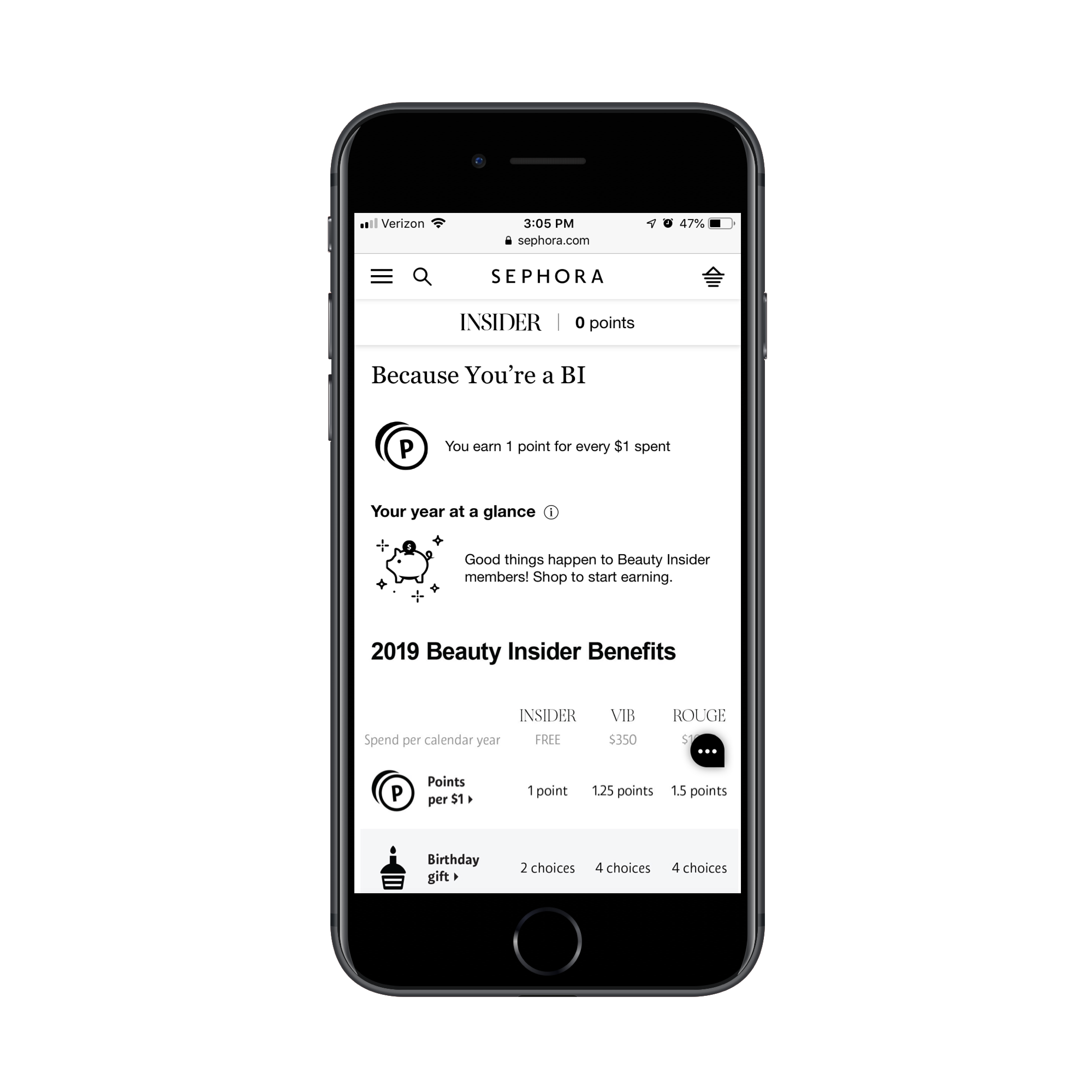
First, it simply explains that users earn 1 point for every $1.00 spent. But the comparison table below reveals that there’s more to the program than that:
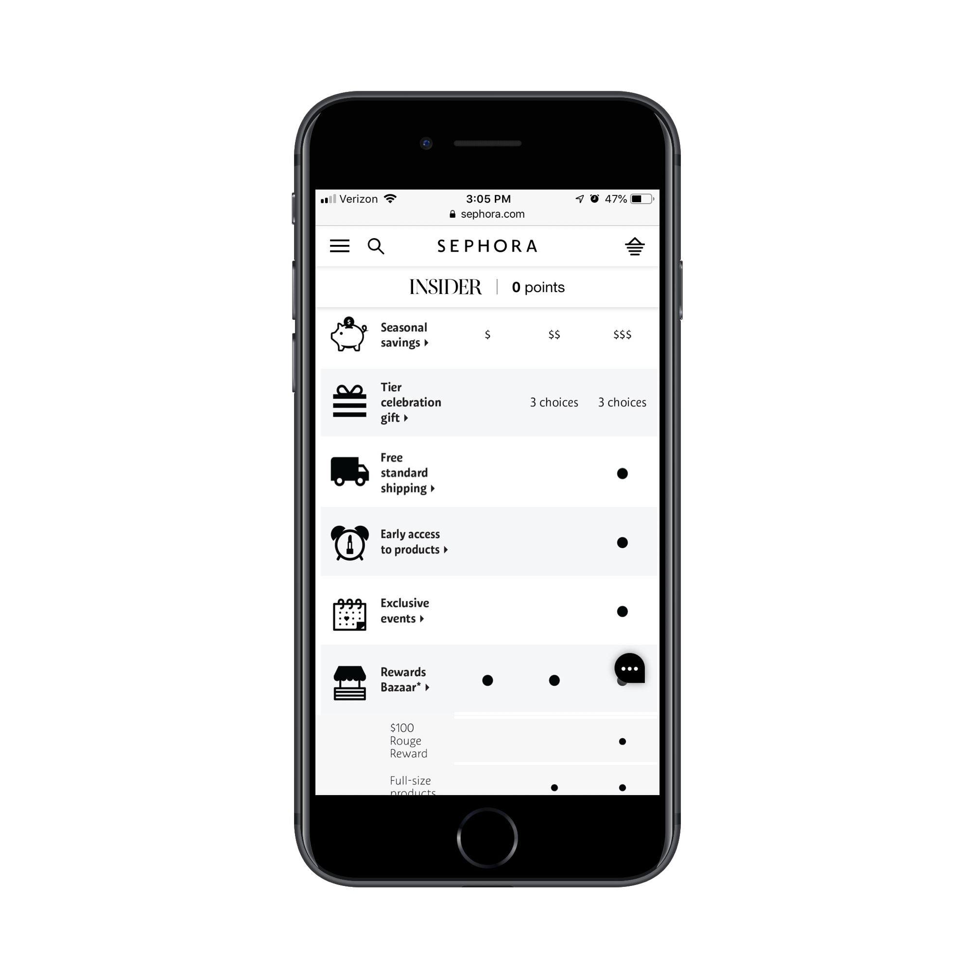
As Beauty Insider members reach certain spending tiers, even more benefits become available. For instance, after they’ve spent their first $350, they’ll start getting 1.25 points for every $1.00 spent. New rewards become available, too, like full-size beauty product samples and celebration gifts.
If you want to motivate users to install your loyalty app and keep spending money through it, clearly show them what they’re missing.
4. Simplify Future Purchases
The whole point in creating a loyalty program is to retain a customer’s business for the long run. To do that, you have to find ways to make them buy again and again.
Now, a lot of that rests on your client’s shoulders as they’re the ones who will shape the offers that entice them back to the app. However, you have a part to play as well.
Let’s use World of Hyatt to demonstrate how you might do this.
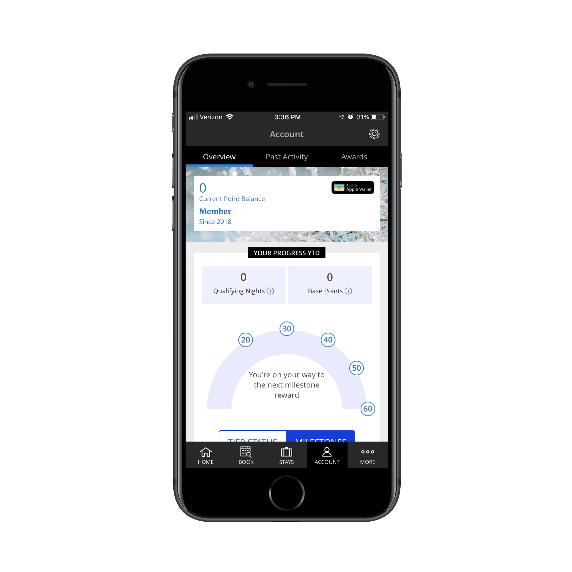
This is Hyatt Hotels’ loyalty program app. Users can view points accumulation, manage account preferences and book new hotel stays.
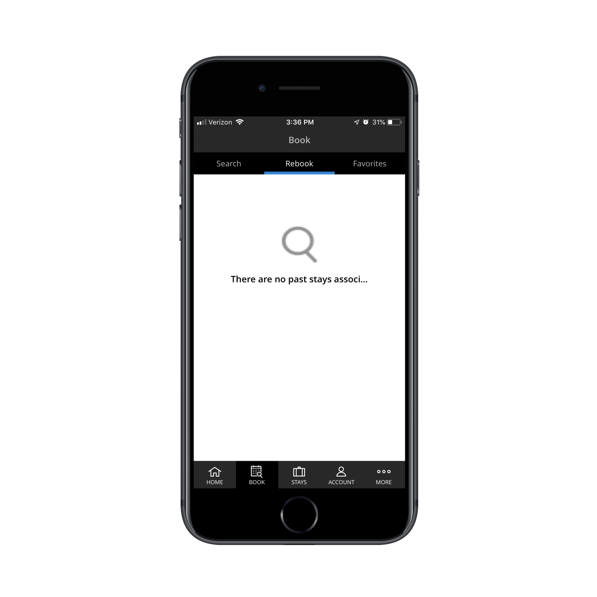
Users can also quickly rebook previous reservations:
And if that isn’t helpful enough, users can set custom room preferences from their account settings:
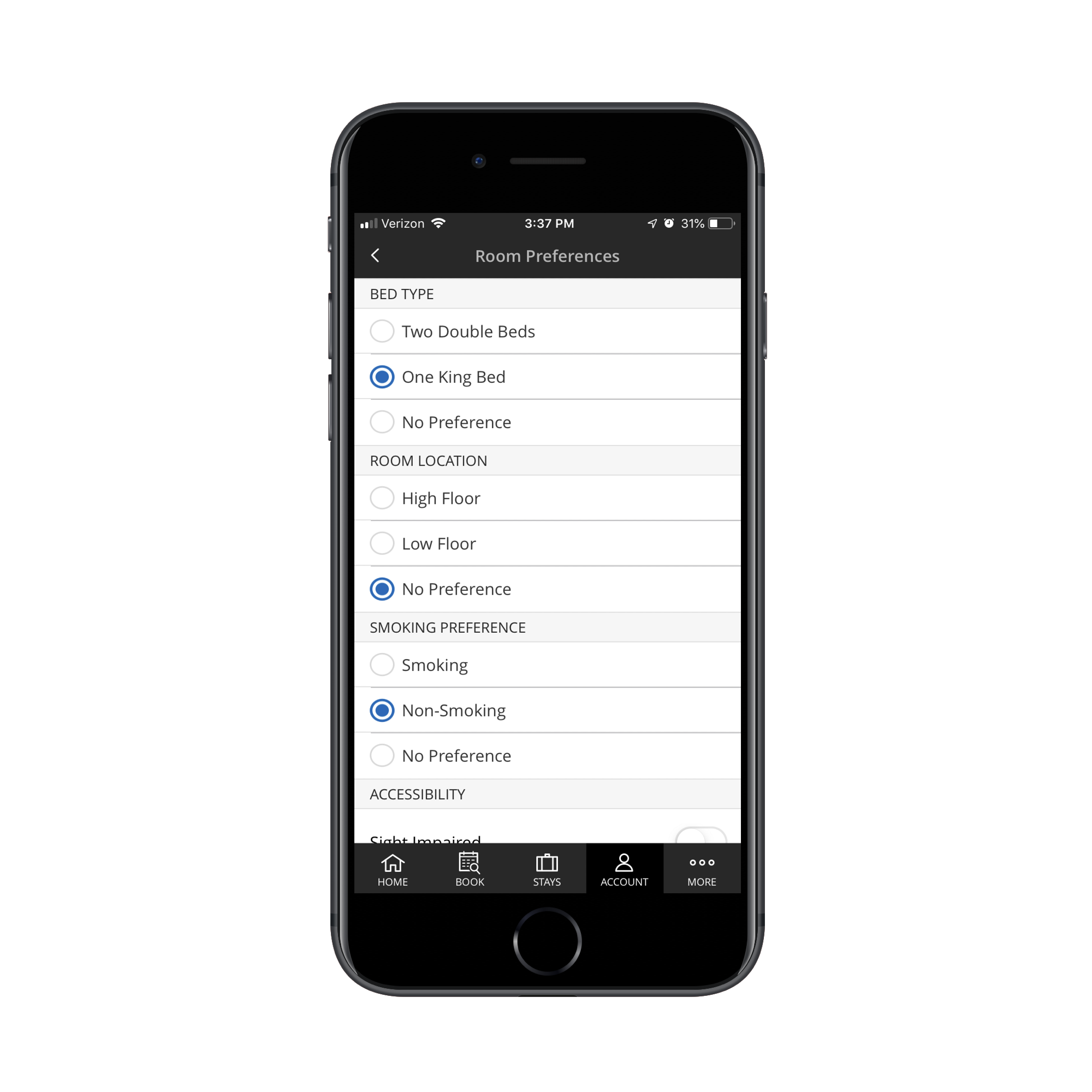
This way, the World of Hyatt app won’t waste their time showing rooms that don’t fit their ideal specifications as they try to book something new.
While the simplification of preferences and setting up repeat or recurring purchases will look differently from app to app, it’s an important feature to build in whenever you can. If you can show your users that you understand how tedious it is to enter the same details every time or to repeat a process even though nothing has changed, they’ll be more likely to return.
Wrap-Up
There’s one other thing I want to add here and it’s this:
When your client asks you to build a loyalty app, make sure it’s the right thing to do. Because if their business is new and they have absolutely no brand name recognition or long-term trust to leverage, it might be difficult to get people to subscribe to the program. No matter how beautifully you design the app experience.
And because loyalty members want access to their rewards on mobile, that’s going to leave you with two costlier choices than a website.
It might be best to explain the risks of creating a loyalty program without a huge demand for one. And, instead, recommend creating on-site promotions and offers they can share through email to start.
Then, when they’re ready, you can sit down with them and explain how a PWA or mobile app loyalty program will help them attract a better quality of customer and hold onto them for longer.


