This article was originally published on OutSystems. Thank you for supporting the partners who make SitePoint possible.
Animating elements in your mobile application is easy. And animating elements in your mobile applications properly is easy, too… if you follow our tips here. While everyone uses CSS3 animations in mobile these days, many do so incorrectly. Developers often disregard best practices. This happens because people don’t understand the reasons why those practices exist and why they are so vigorously endorsed. The spectrum of device specifications is wide. So if you don’t optimize your code, you will deliver a sub-par experience to the highest share. Remember: some high-end flagship devices push the envelope, but most of the world uses the type of device that, when compared to those spec monsters, looks like an abacus with an LCD screen. We want to give you a hand in harnessing the power of CSS3 correctly. To do that, we need to understand a few things first. tUnderstand the Timeline
What does the browser do while rendering and playing around with elements? This timeline is called the Critical Rendering Path: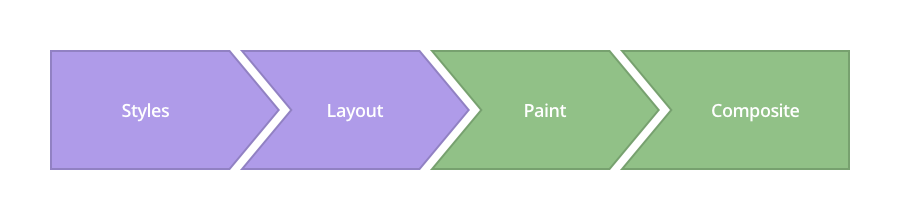 Image Source: www.csstriggers.com
To achieve smooth animations we need to focus on changing properties that affect the Composite step, instead of adding this stress to previous layers.
1. Styles
Image Source: www.csstriggers.com
To achieve smooth animations we need to focus on changing properties that affect the Composite step, instead of adding this stress to previous layers.
1. Styles
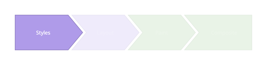 The browser starts calculating the styles to apply to elements — recalculate Style.
2. Layout
The browser starts calculating the styles to apply to elements — recalculate Style.
2. Layout
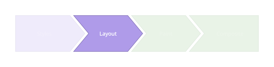 In the following layer, the browser generates the shape and position of each of those elements — Layout. This is where the browser sets the page properties such as
 width and height , as well as its margin or left/top/right/bottom, for instance.
3. Paint
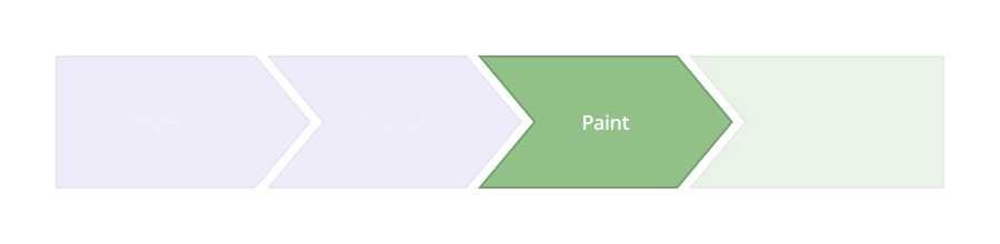 The browser fills in the pixels for each element into layers. It refers to these properties:
 box-shadow, border-radius, color, background-color, and others.
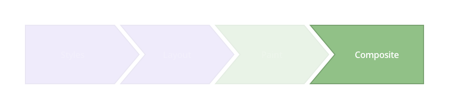
4. Composite
This is where you want to perform your animation, as this is when the browser draws all the layers to the screen.
 Modern browsers can animate four style attributes pretty well, making use of the
 transform and opacity properties.
- Position — transform: translateX(n) translateY(n) translateZ(n);
- Scale — transform: scale(n);
- Rotation — transform: rotate(ndeg);
- Opacity — opacity: n;
How to Achieve 60 Frames Per Second
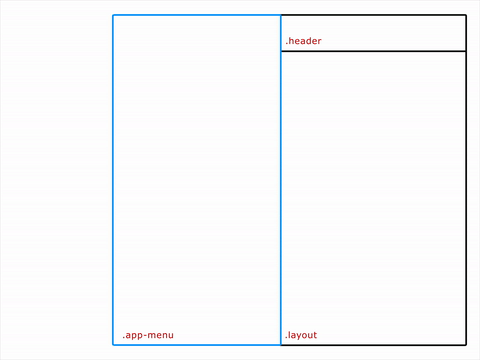
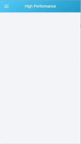
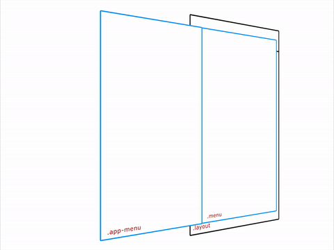
With this in mind, it’s time to roll up our sleeves and get to work. Let’s start with the HTML. We’re going to create a very simple structure and put our app-menu inside a layout class.
<div class="layout">
  <div class="app-menu"></div>
  <div class="header">
    <div class="menu-icon"></div>
  </div>
</div>
Going About It the Wrong Way
.app-menu {
  left: -300px;
  transition: left 300ms linear;
}

.app-menu-open .app-menu {
  left: 0px;
  transition: left 300ms linear;
}
left/top/right/bottom properties. Those don’t create fluid animations because they force the browser to perform a layout pass each time, which affects all of the element’s children.
The result is something like this:
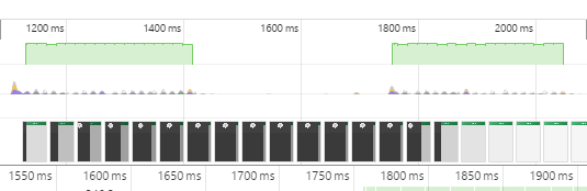
 That animation is not too smooth. We checked with the DevTools Timeline to see what was happening under the hood, and this was the result:
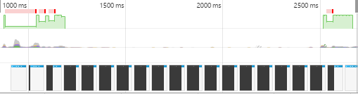 Green areas represent the time spent rendering an animation.
This data presents irregular frame-rates and slow performance.
Green areas represent the time spent rendering an animation.
This data presents irregular frame-rates and slow performance.
“The green bar indicates FPS. A high bar indicates that the animation is rendering at 60 FPS. A low bar indicates sub-60 FPS. So, ideally, you want the green bar to be consistently high across the Timeline. Those red bars also indicate jank, so, alternatively, another way to gauge your progress is by eliminating those red bars.”
Thank you, Kayce Basques!
Using Transform
.app-menu {
  -webkit-transform: translateX(-100%);
  transform: translateX(-100%);
  transition: transform 300ms linear;
}
.app-menu-open .app-menu {
  -webkit-transform: none;
  transform: none;
  transition: transform 300ms linear;
}
transform properties affect the Composite step, rather than the Layout. Here, we inform the browser that our layers are stable before the animation begins, so we experience fewer hiccups when rendering the animation.
 That’s exactly what Timeline reflects:
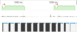 The results start getting better, frame-rate appears to have stabilized and, therefore, the animation runs smoother.
Running Animations in GPU
Let’s take it up a notch, then. To really get it running smooth, we’re going to use the GPU to render the animation.
.app-menu {
  -webkit-transform: translateX(-100%);
  transform: translateX(-100%);
  transition: transform 300ms linear;
  will-change: transform;
}
translateZ() or translate3d() as fallbacks, the will-change property is the future. This property promotes the elements to another layer, so the browser doesn’t have to consider the layout render or painting.
 See how smooth that is? Timeline substantiates that:
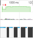 The animation’s frame-rate is more constant and the animation renders quicker. But there’s still a long frame running there at the beginning: a little bit of a bottleneck at the beginning.
Remember the HTML structure we created at the beginning? Let’s take a look at how we controlled the
The animation’s frame-rate is more constant and the animation renders quicker. But there’s still a long frame running there at the beginning: a little bit of a bottleneck at the beginning.
Remember the HTML structure we created at the beginning? Let’s take a look at how we controlled the app-menu div in JavaScript:
function toggleClassMenu() {
  var layout = document.querySelector(".layout");
  if(!layout.classList.contains("app-menu-open")) {
    layout.classList.add("app-menu-open");
  } else {
    layout.classList.remove("app-menu-open");
  }
}
var oppMenu = document.querySelector(".menu-icon");
oppMenu.addEventListener("click", toggleClassMenu, false);
layout div. This forced the browser to regenerate our style tree — and that affected the rendering performance.
The 60 FPS Smooth as Butter Solution
What if we create the menu outside of the viewport area? Having the menu in an isolated area will ensure that we only affect the element that we wish to animate. So, we propose the following HTML structure:
<div class="menu">
  <div class="app-menu"></div>
</div>
<div class="layout">
  <div class="header">
    <div class="menu-icon"></div>
  </div>
</div>
transitionend function in JavaScript.
function toggleClassMenu() {
  myMenu.classList.add("menu--animatable");
  if(!myMenu.classList.contains("menu--visible")) {
    myMenu.classList.add("menu--visible");
  } else {
    myMenu.classList.remove("menu--visible");
  }
}

function OnTransitionEnd() {
  myMenu.classList.remove("menu--animatable");
}

var myMenu = document.querySelector(".menu");
var oppMenu = document.querySelector(".menu-icon");
myMenu.addEventListener("transitionend", OnTransitionEnd, false);
oppMenu.addEventListener("click", toggleClassMenu, false);
myMenu.addEventListener("click", toggleClassMenu, false);
.menu {
  position: fixed;
  left: 0;
  top: 0;
  width: 100%;
  height: 100%;
  overflow: hidden;
  pointer-events: none;
  z-index: 150;
}

.menu--visible {
  pointer-events: auto;
}

.app-menu {
  background-color: #fff;
  color: #fff;
  position: relative;
  max-width: 400px;
  width: 90%;
  height: 100%;
  box-shadow: 0 2px 6px rgba(0, 0, 0, 0.5);
  -webkit-transform: translateX(-103%);
  transform: translateX(-103%);
  display: flex;
  flex-direction: column;
  will-change: transform;
  z-index: 160;
  pointer-events: auto;
}

.menu--visible .app-menu {
  -webkit-transform: none;
  transform: none;
}

.menu--animatable .app-menu {
  transition: all 130ms ease-in;
}

.menu--visible.menu--animatable  .app-menu {
  transition: all 330ms ease-out;
}

.menu:after {
  content: '';
  display: block;
  position: absolute;
  left: 0;
  top: 0;
  width: 100%;
  height: 100%;
  background: rgba(0,0,0,0.4);
  opacity: 0;
  will-change: opacity;
  pointer-events: none;
  transition: opacity 0.3s cubic-bezier(0,0,0.3,1);
}

.menu--visible.menu:after {
  opacity: 1;
  pointer-events: auto;
}
 And what does Timeline show us?
 Green bars for days, baby. Want to see a live example? Click here.
Frequently Asked Questions (FAQs) about Mobile Animations
What are the key principles to consider when creating mobile animations?
When creating mobile animations, it’s crucial to consider several key principles. Firstly, the animation should serve a purpose and enhance the user experience, not just be there for aesthetic reasons. Secondly, the animation should be smooth and fluid, maintaining a consistent frame rate of 60 frames per second (fps) to ensure a seamless user experience. Lastly, the animation should be responsive and interactive, reacting to the user’s actions in a predictable and intuitive way.
How can I achieve 60 fps in mobile animations?
Achieving 60 fps in mobile animations requires careful optimization of your CSS3 code. This includes using hardware-accelerated CSS properties, such as transform and opacity, which can be processed by the device’s GPU rather than the CPU. Additionally, you should avoid properties that trigger layout or paint operations, as these can be costly in terms of performance.
What are some common types of mobile animations?
There are several common types of mobile animations, including loading animations, navigation animations, feedback animations, and instructional animations. Loading animations are used to entertain or distract the user while content is loading, while navigation animations help guide the user through the app’s interface. Feedback animations provide visual feedback in response to user actions, and instructional animations help educate the user about how to use certain features of the app.
How can I create mobile animations using SVG?
SVG, or Scalable Vector Graphics, is a powerful tool for creating mobile animations. SVG animations are resolution-independent, meaning they look sharp on any screen size, and they can be manipulated using CSS or JavaScript. To create an SVG animation, you would first create your SVG graphic, then use CSS or JavaScript to animate the SVG elements.
What are some good resources for mobile animation inspiration?
There are many online resources where you can find inspiration for mobile animations. Websites like Dribbble and Pinterest feature a wide variety of mobile animation designs from designers around the world. Additionally, websites like CodePen allow you to explore and experiment with different animation techniques and code snippets.
How can I test the performance of my mobile animations?
There are several tools and techniques you can use to test the performance of your mobile animations. Browser developer tools, such as Chrome DevTools, provide a performance panel where you can record and analyze your animations. Additionally, there are online tools like JSFiddle and CodePen where you can test and debug your animation code.
What are some common mistakes to avoid when creating mobile animations?
Some common mistakes to avoid when creating mobile animations include overusing animations, not optimizing for performance, and not considering the user’s context. Overusing animations can distract and annoy the user, while poor performance can lead to a frustrating user experience. Additionally, it’s important to consider the user’s context and use animations that are appropriate for the user’s device and situation.
How can I learn more about mobile animation techniques?
There are many resources available for learning more about mobile animation techniques. Online tutorials and courses, such as those offered by Codecademy and Udemy, can provide in-depth instruction on various animation techniques. Additionally, websites like CSS-Tricks and Smashing Magazine offer a wealth of articles and tutorials on the subject.
Can I use CSS3 to create complex animations?
Yes, CSS3 is capable of creating complex animations. With CSS3, you can animate any CSS property, and you can use keyframes to create multi-stage animations. However, for more complex animations, you may find it easier to use a JavaScript animation library, such as GreenSock or Anime.js.
How can I optimize my animations for mobile devices?
Optimizing animations for mobile devices involves several strategies. Firstly, you should aim to maintain a consistent frame rate of 60 fps. This can be achieved by using hardware-accelerated CSS properties and avoiding properties that trigger layout or paint operations. Secondly, you should ensure your animations are responsive and adapt to different screen sizes and orientations. Lastly, you should test your animations on a variety of devices to ensure they perform well across different hardware and network conditions.
 Jose Rosario
Front End Developer at OutSystems working on the Silk Team.