


 Håkon Wium Lie first sketched out media queries in his initial CSS proposal in 1994. Unfortunately, we had to wait another 8 years till it became a recommended W3C standard in June 2012.
When browsers started to widely support media queries, we thought that all our problems were solved. We had the solution to the evolving landscape of diverse devices from small smartwatches to big televisions.
DeviceAtlas reported in their Q4 2016 report as many as 79 different screen sizes hitting their servers from the United States alone over that quarter. This is just a subset of the variety of devices that are out there.
With this huge diversity in screen sizes, how do we find the best breakpoints to format our web apps?
Note: When referring to web app in this article I mean anything from as large as Facebook with tonnes of users and complex backends to something as simple as a small personal website.
Don’t use popular screen sizes for breakpoints
One of the most used techniques is choosing breakpoints based on the width of the most popular devices at the time of production. So 320px for iPhone, 480px for iPhone landscape, 768px for iPad and 1024px for bigger screens like laptop/desktop. This isn’t surprising since initially, it makes logical sense, but I believe Brad Frost says it best about using this approach:
“Every time you see 320px, 480px, 768px, 1024px used as breakpoint values, a kitten gets its head bitten off by an angel…or something like that.”
Brad Frost
The main issue with this approach is that in most cases there will be points in between these breakpoints where our web app won’t adapt well and the content may not look its best. Also, with an expanding landscape of devices it’s not feasible to define breakpoints for all devices, and the popular devices of today may not be the same as tomorrow. Should UX designers be satisfied with designs that breaks on less popular devices and risk losing some percentage of users? This is where we come to a second, better, way of choosing our breakpoints: letting our content decide our breakpoints.
Using content for breakpoints
According to the Media Queries spec by Mozilla Developer Network:
“Media queries, added in CSS3, let the presentation of content be tailored to a specific range of output devices without having to change the content itself.”
MDN
This quote emphasises that we should use media queries to “let the presentation of content be tailored”, and shows that media queries and content should work hand-in-hand.
So to decide where our breakpoints will sit based on our content, we will use a mobile-first approach and design our site first for mobile. We will then expand our screen width until the UX look and feel doesn’t work well, and that’s where we need to introduce a breakpoint.
Content-driven breakpoints in action
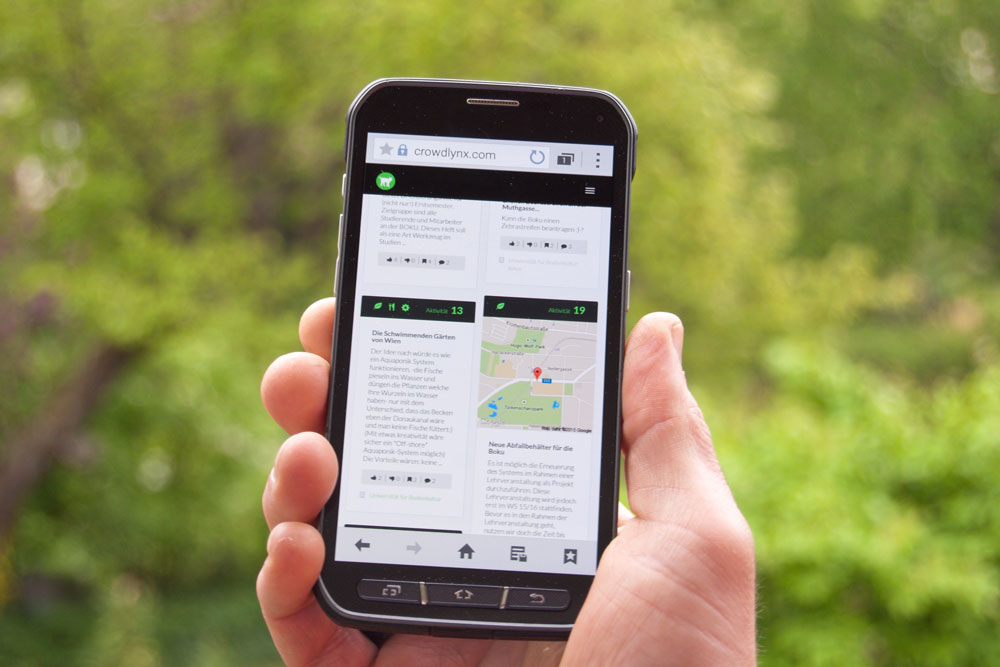
For an example of how this approach would improve the UX , I looked at the Irish Rail website. It looks like they used the popular screen sizes method to define their breakpoints. After searching for your journey information you’ll be served a page containing the train times for that journey. In the video below, I used the method mentioned above, expanding the screen width from mobile to desktop and making sure there aren’t any problems with the UX.
As you can see from the video, the breakpoints 788px and 1400px should have been introduced a lot earlier. The main reason is because the departure and arrival times become too far apart, which requires the user to do a lot of looking left and right, making it hard to scan. This could be avoided by choosing breakpoints based on what the content needs rather than by using popular screen sizes.
Major breakpoints vs Minor breakpoints
Now with this approach, you might be thinking that in some cases you may end up with too many breakpoints, having one for every small issue in a page. This is where having both major and minor breakpoints comes in.
Major breakpoints are breakpoints that you use across many pages on your web app and for many different elements in your web app. You should space these out. They would generally fall around the mobile, tablet and desktop sizes. Even though they fall around these sizes, they should still be optimised for your content as mentioned above.
Minor breakpoints (also known as tweakpoints) are then used to target one or a small group of elements in your web app. An example of this could be if your navigation requires an extra breakpoint that doesn’t match your major breakpoints. You can create an extra breakpoint where needed for this. This will give you the ability to provide an optimal experience. You can then choose to serve these to a limited number of pages that you need it on. This will reduce CSS bloat that is often found while using media queries.
Working with responsive frameworks
Over the last few years, responsive frameworks like Bootstrap and Zurb’s Foundation have become very popular. These frameworks provide tried and tested CSS components that allow you to get your web app up and running even quicker.
One of the main components these responsive frameworks have is a customisable responsive grid system. This provides developers with many classes to control the width of elements at different screen sizes. This gives developers the ability to organise elements in a grid-like fashion. The creators of these frameworks don’t know how you’ve designed your web app and what content you’re displaying on each screen. This is why they provide you with a default set of breakpoints.
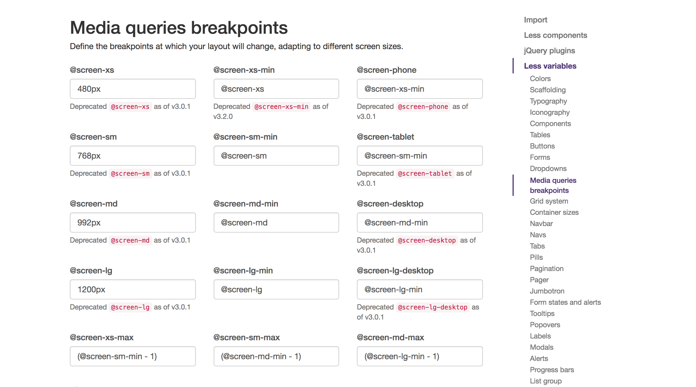
One of the main problems with these frameworks is that their users leave the default breakpoints for that framework in place. We should optimise these breakpoints based on our content in our web app. In more occasions than not, these breakpoints will be the same as our major breakpoints. You can see from the image below how easy Bootstrap makes it to customise these settings from within their “customize section“.
Reducing weight based on breakpoints (server-side)
We can use breakpoints for more than media queries to improve UX. Breakpoints can also be used for server-side segmentation, which can reduce page weight. We can do this by using a device detection solution like DeviceAtlas to segment traffic based on our major breakpoints. This page weight reduction will come from stripping out unnecessary code and optimising images for each breakpoint.
Summary
In this article, we went over the way most people choose breakpoints and how it’s better to optimise them based on the content in our web app.
We also briefly talked about the difference between major and minor breakpoints and how these ideas fit into popular responsive frameworks.
Finally, we touched on how we can use breakpoints for more than media queries and are an effective way to improve performance. This can be achieved by segmenting traffic and serving different code based on breakpoints which will reduce page weight.
Putting these ideas into practice while developing your web app will not just give you greater control over the content of your web app, but will also deliver a better user experience for the end user.


Leave a Reply