A few years ago I started to hear a lot about Web Components. I got pretty excited and then totally forgot about them as the noise settled down. It turns out there has been some good movement and support is starting to increase. Responsive Web Components, in particular, are set to really simplify how we approach responsive design. As promising as this sounds, there are four questions many developers out there will want to know before they start using them today:
Will they…
- Fit into the current state of the web?
- Work cross browser?
- Adapt to fit the space they are dropped into?
- Promote modular code?
In this article, we will explore the answers to each of those questions!
What Are Web Components?
Essentially, they are a W3 specification that enables you to build your own HTML elements. If you literally don’t know anything about them it may be worth having a quick read up about them as some of the terms I use in the article require a basic understanding.
Why Would I Want To Use Them?
A good example of when you might want to use Web Components would be when you are building UI that doesn’t exist natively in the browser — elements such as color pickers, carousels, accordions or typeaheads. Alternatively, you are likely to have some components that you use all the time across various sites that you are sick of rebuilding every time. These are things like social buttons, subscribe forms or notifications. With Web Components you can bundle up your markup, styles and scripts into encapsulated modules using HTML tags like <color-picker></color-picker> to reference them. This will seem familiar if you have used Angular directives or React components but the benefit here is that it is native to the browser and framework agnostic.
Web Components enable you to build pieces of UI once and use them everywhere. This is ideal for projects like a living styleguide where you want to build a library with a single source of truth for each of your components. This approach means repeating less code and having portable components that you or your team can simply drop references to into your interface.
Another big advantage of using Web Components is the ability to package these components up and share them with other developers or website owners. Essentially, the consumer can put an import statement in their web page such as:
<link rel="import"
      href="http://url.com/subscribe-form.html">
Then use the custom element tag you’ve defined in that component. With this imported into their webpage, they can have as many instances of the custom component on their page as they wish. In the subscribe form example, we could use the tag <subscribe-form></subscribe-form> in multiple locations on the page. Of course, if you are doing this, you need to ensure that the beautiful component you have crafted is extremely flexible and will work across a range of devices and screen sizes.
Turning These Bad Boys Into Responsive Web Components
I feel the best way to demonstrate is by example, so I’ll continue with the subscribe form which is a common piece of UI that doesn’t change much between different sites and implementations.
Here’s one I made earlier:
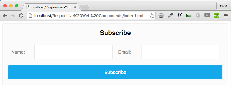
Inside my Web Component template I have some basic markup for the form.
<ul class="form">
  <li class="form__item">
    <label for="name">Name:</label>
    <input id="name" name="name" type="text">
  </li>
  <li class="form__item">
    <label for="name">Email:</label>
    <input id="name" name="name" type="text">
  </li>
</ul>
My markup and CSS are tucked away inside my component making use of the Shadow DOM part of the specification. This gives me encapsulation, allowing me to use label and input selectors freely in my code without worry of other styles bleeding in or mine bleeding out into the parent site.
For clarity and brevity, I’m not going to write out the styles other than ones used for layout. I’ve used a combination of float: left and display: table to achieve this layout to prevent breaking in any widths.
.form__item {
  display: table;
  float: left;
  width: 50%;
}

label {
  display: table-cell;
  width: auto;
}

input {
  display: table-cell;
  width: 100%;
}
I’ll be using HTML imports to pull it into the SitePoint site as a demonstration:
Now we’re all set up, let’s look at some responsive techniques.
Media Queries
The classic approach that we know and love is still alive and well inside Responsive Web Components. These can be applied inside your template when you code your component if you want to bake in some breakpoints, or you can apply a hook (for example, by using a class) to the container if you want to leave that decision to your consumer. In this case, all we need to do is strip the floats and adjust them to be full width.
@media (max-width: 30em) {
  .form__item {
    float: none;
    width: 100%;
  }
}
However, media queries aren’t going to be enough to save us this time.
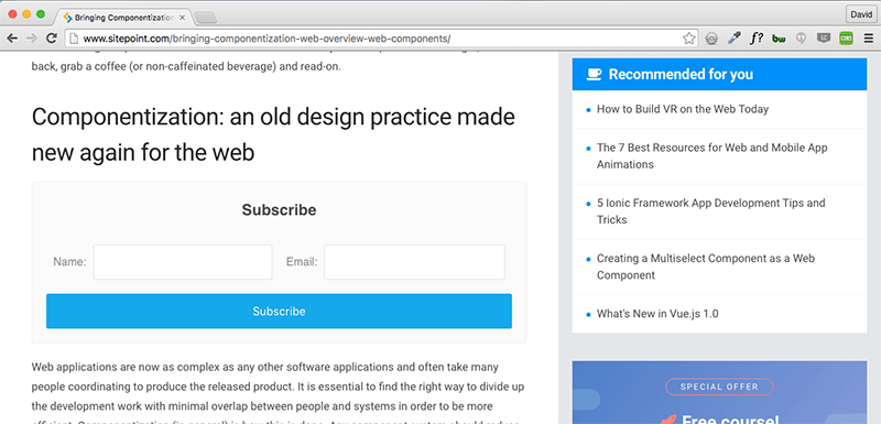
I’m happy with my sign up form styles and it works fine in the body, but what happens when the website author wants to chuck it into their sidebar? Suddenly my form looks squashed and isn’t really usable.
This is because the component is not aware of its boundaries – it has no context.
The whole point of Web Components is you can drop them anywhere and they’ll just work right? So obviously this won’t do, but there are a few techniques you can use to ensure your components are responsive and contextual.
Flexbox Trickery
If you’re looking at using Web Components, odds are you’re only supporting modern browsers and not worrying about IE9, in which case, a bit of Flexbox magic might be perfect for you to turn these into Responsive Web Components. This is my preferred approach as it doesn’t require any additional JavaScript.
Once again, the code sample here is purely showing the layout styles I’ve used:
.form {
  display: flex;
  flex-wrap: wrap;
}

.form__item {
  align-items: center;
  display: flex;
  flex: 1 0 320px;
  flex-wrap: wrap;
  max-width: 100%;
}

label {
  flex: 1 0 90px;
}

input {
  flex: 1 0 230px;
  width: 100%;
}
By setting the container to display: flex; flex-wrap: wrap, the .form__item elements will appear side-by-side, but we still need to make a few adjustments so that when the container gets too small they will stack nicely.
Inside the .form__item, I’ve used the flex shorthand of flex: 1 0 320px; which translates in flex terms to — grow of one, flex shrink of zero, and flex basis of 320 pixels. Having flex-wrap set to wrap means it won’t be any smaller than the basis we set (320px) but setting it to flex means it will take up the rest of the available space.
I have given a similar treatment to the label and input elements. Their combined flex values total 320, which means they will behave as desired at smaller container sizes.
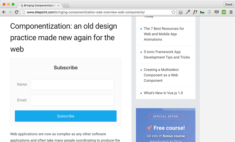
With these adjustments in place, let’s take a look at that same form in SitePoint’s sidebar:
Much better! However, there is more than one way to skin a cat.
Element Queries
The idea of element queries is that you are able to emulate media query type functionality but at a component level — very handy for Responsive Web Components. Essentially, imagine being able to write something like this in your CSS:
.form__item[max-width~="30em"] {
  /* Styles here */
}
With element queries that is exactly what we can do. Pretty powerful right?
Unfortunately, this technique isn’t available natively due to browser vendors being concerned with the potential to cause infinite loops. However, some smart people have written plugins to enable this functionality.
In my example, I have used CSS Element Queries by Marc J Schmidt which is a really nice implementation. There are also the following similar projects:
Essentially what they do is use JavaScript to detect the width of the component and modify an attribute so that you are able to style it in CSS. Some are event driven and some based on resize.
.form__item[max-width~="30em"] {
  float: none;
  width: 100%;
}
With the combination of one of these plugins and a small code snippet similar to the above we are able to get the exact same result as the flexbox implementation in the sidebar.
Attributes
One of the cool things we can offer to consumers of our Responsive Web Components is an API via attributes. For example, you could set up a attribute called layout and have sizes of “small” and “large”. Our consumer of the component could then use it as follows:
<subscribe-form layout="small"></subscribe-form>This would trigger the styles for the small implementation.
In the Shadow DOM, the containing element is known as the :host. An example could look like so:
:host {
  display: block;
}

:host([layout = "small"]) .form__item {
  float: none;
  width: 100%;
}

:host([layout = "large"]) .form__item {
  display: table;
  float: left;
  width: 50%;
}
This would then allow the component consumer to write some simple JavaScript to flip between the different sizes that you’ve provided them. This means instead of loading additional JavaScript inside of your module, you can leave it up to the consumer to decide how they want to hook into it. This allows your component to become more future proof.
Try It Yourself!
If you’re interested in seeing the flexbox version I refer to in this demo in action on your own machine, you can do the following in Chrome:
- Install the CORS Chrome extension and turn it on. This is to allow HTML Imports to work from external sites.
- Either refresh this page or open any website in a new tab or window so the extension kicks in.
- In Chrome developer tools, add this inside the
<head>tag:<link rel="import" href="http://wsh.webfactional.com/web_components/components/ cm-subscribe-form--flex.html"> - Finally, add:
somewhere inside the<cm-subscribe-form-flex></cm-subscribe-form-flex><body>and you should see my subscribe form auto-magically pulled through. Enjoy!
Conclusion
The approaches above can actually be used for any UI development but they lend themselves particularly well to Responsive Web Components due to their reusable and shareable nature.
If you haven’t checked out Web Components yet I would strongly encourage you to do so. While the full spec is currently only available natively in Chrome and Opera, the other browser vendors aren’t far behind.
If you’re interesting in learning more about Responsive Web Design, check out our new book, Jump Start Responsive Web Design, written by Chris Ward.Frequently Asked Questions (FAQs) on Responsive Web Components
What are the key elements of a well-designed responsive web component?
A well-designed responsive web component should be flexible, adaptable, and efficient. It should have a fluid grid system that allows the layout to adjust according to the screen size. It should also have flexible images and media that can resize to fit the screen. Moreover, it should have media queries that allow the website to use different CSS style rules for different devices based on characteristics like screen size, resolution, and orientation. Lastly, it should be efficient in terms of loading time and performance.
How do CSS container queries contribute to responsive components?
CSS container queries, also known as element queries, allow styles to be applied based on the size of a parent container rather than the viewport. This means that a component can adapt its layout based on its own size, making it truly responsive. This is particularly useful for components that are reused in different contexts and need to adapt to their surroundings.
What is the role of JavaScript in creating responsive web components?
JavaScript plays a crucial role in creating responsive web components. It can be used to manipulate the DOM, handle events, and create dynamic content. It can also be used in conjunction with CSS media queries to create more complex responsive behaviors. For example, JavaScript can be used to load different scripts or content based on the screen size or device capabilities.
How can I ensure that my responsive web components are accessible?
Accessibility should be a key consideration when designing responsive web components. This includes ensuring that text is readable at all screen sizes, that interactive elements are large enough to be easily tapped on touch screens, and that the site is navigable with a keyboard for those who can’t use a mouse. Additionally, you should use semantic HTML to provide context and meaning to screen readers, and ensure that color contrast is sufficient for those with visual impairments.
What are some common challenges in creating responsive web components and how can they be overcome?
Some common challenges include dealing with different screen sizes and resolutions, ensuring compatibility with different browsers and devices, and optimizing performance. These can be overcome by using a mobile-first approach, testing on a variety of devices, using feature detection to ensure compatibility, and optimizing images and scripts for performance.
How does a responsive web component affect SEO?
Responsive web components can have a positive impact on SEO. Google’s algorithms favor websites that are mobile-friendly, and responsive design is a key aspect of this. Additionally, having a single responsive site rather than separate desktop and mobile versions avoids issues with duplicate content, which can negatively impact SEO.
How can I test the responsiveness of my web components?
There are several tools and techniques for testing the responsiveness of web components. These include resizing your browser window to see how the layout adapts, using the device emulation features in browser developer tools, and using online tools like Google’s Mobile-Friendly Test.
What is the future of responsive web components?
The future of responsive web components is likely to involve more advanced techniques and technologies. This could include things like container queries, which are currently being developed, as well as more use of AI and machine learning to adapt layouts based on user behavior and preferences.
How can I learn more about creating responsive web components?
There are many resources available for learning about responsive web components. These include online tutorials and courses, books, and community forums. Additionally, experimenting with creating your own responsive components and studying the code of others can be a great way to learn.
Can I use frameworks or libraries to create responsive web components?
Yes, there are many frameworks and libraries available that can help you create responsive web components. These include Bootstrap, Foundation, and React, among others. These tools provide pre-designed components and layouts that are already responsive, saving you time and effort. However, it’s still important to understand the underlying principles of responsive design in order to use these tools effectively.
 David Berner
David is a front-end developer from the UK who has been coding since 1998 when spacer gifs and blink tags were still a thing. He is passionate about moving the web forward and writes about this (and all things front-end) over at fedordead.com.