Designing Responsive Progressive Web Apps

When Frances Berriman and Alex Russell first defined the characteristics of Progressive Web Apps, responsive design was at the top of their list. Despite this fact, most of the early examples of Progressive Web Apps aren’t responsive.
That’s okay. It’s still the early days of Progressive Web Apps. Many responsive websites started with mobile-only implementations until they got the wrinkles ironed out. And frankly, designing responsive Progressive Web Apps is more difficult than people realize.
Why responsive Progressive Web Apps are difficult
Responsive Progressive Web Apps force us to tackle design challenges that we’ve been been able to side-step thus far.
At the heart of it are two questions that the web community has debated since the introduction of the iPhone for which there is no consensus:
- What makes something an app?
- How do user’s expectations change when they consider something to be an app?
In the early days after the iPhone’s launch, web designers often tried to ape native conventions. Mobile websites adopted tab bars on the bottom of the screen, mimicked iPhone list-based navigation, and even flirted with skeuomorphism.
Over the years, the amount of aping has decreased as responsive web designs have formed their own conventions. And our concern over our mobile websites fitting in amongst native apps has diminished.
But Progressive Web Apps, with their potential ability to behave like native apps, bring these unresolved questions about what is an app, and what do people expect of an app, back to the fore.
What does it mean to design a great Progressive Web App?
Owen Campbell-Moore, a Google employee working on Progressive Web Apps, wrote an article entitled Designing Great UIs for Progressive Web Apps. In the article, Owen writes:
Start by forgetting everything you know about conventional web design, and instead imagine you’re actually designing a native app.
Should we really forget everything we know about conventional web design? And when he says we should imagine we’re designing a native app, on what platform and form factor does this native app run?
Owen continues:
It’s important to pay attention to detail here since native apps have given users expectations around touch interactions and information hierarchy which are important to match to avoid creating a jarring experience.
This idea of avoiding a jarring experience for native app users gets to the heart of the question about user expectations.
If we design something to meet the expectations of native app usersFootnote 1 , are we then accommodating those users while creating a jarring experience for everyone else?
Owen’s recommendations err on the side of feeling more “appy” at the expense of feeling “webby.” He isn’t making these recommendations because he dislikes the web. Anyone working on Progressive Web App implementations for browser makers falls into the camp of people who love the web.
Owen makes these recommendations because he is trying to match what he perceives as user expectations for apps. Owen and his colleagues at Google have seen far too many developers try to take their desktop site and scale it down to be responsive. That simply won’t cut it from a performance perspective.
And while I may not agree with every recommendation Owen makesFootnote 2 , his article shines a light on questions of user expectations and what it means to tackle experiences that span apps and web environments.
Let’s look at three design questions that illuminate these challenges.
1. How much do you match the platform?
In his article, Owen Campbell-Moore states:
Users will feel more at home in your Progressive Web App if you tweak it’s style to match their operating system.
This is undoubtedly true. But to what degree should our Progressive Web Apps modify their style based on the operating system?
- Do you use tab bars on iOS?
- Do you use material design on Android and other designs elsewhere?
- Do you use the operating system fonts as Owen suggests?Footnote 3
And how far can you tweak something to match the operating system before you lose the advantages of designing for a single responsive web design?
This is a question that developers building hybrid apps using web technology have faced for years. They often pick tools like PhoneGap because it allows them to use the same code base on multiple platforms.
To be successful in the app stores, their app needs to fit in and provide a great experience. But if they make the app too platform-specific, they lose the advantages of a cross platform code base.
Therefore, I decided to looked at PhoneGap apps to see what I could learn about how they’ve handled this question. Here are some approaches I found.
Simply wrap the mobile website as an app
Many early PhoneGap apps took this approach and users hated it. Often, the implementations were poor. People felt there was no advantage to having an app instead of simply using the mobile website.
When Apple released their App Store Review Guidelines, they addressed this problem directly in the first line about minimum functionality:
Your app should include features, content, and UI that elevate it beyond a repackaged website.
So when it comes to a hybrid app distributed via an app store, this is a bad strategy.
Will it also be a bad strategy when someone adds a Progressive Web App to their home screen?
In that scenario, people will have already been on the mobile website when they add it to their home screen. They’ve already seen the app. Do they expect it to be dramatically different after they install it?
Modify the design on a per platform basis
This is the approach we took when we built PhoneGap apps. We tweaked them to make them feel more like the parent operating system.
Untappd, a popular PhoneGap app, changes the location of the tab bar as well as other icon placements to make the app feel more at home on iOS or Android.
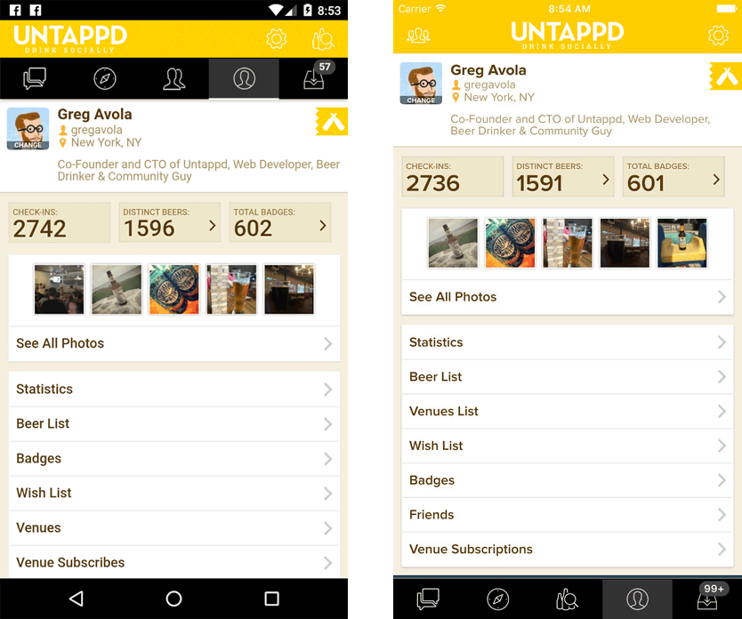
You can argue about how effectively apps like Untappd mask their web roots, but the intent is for the app to fit the expectations of the platform.
Design your own app UI that doesn’t match any platform
It is possible for apps to succeed by adopting app conventions that aren’t tied to any particular platform.
Tripcase is a good example of this. The app looks exactly the same on both iOS and Android.
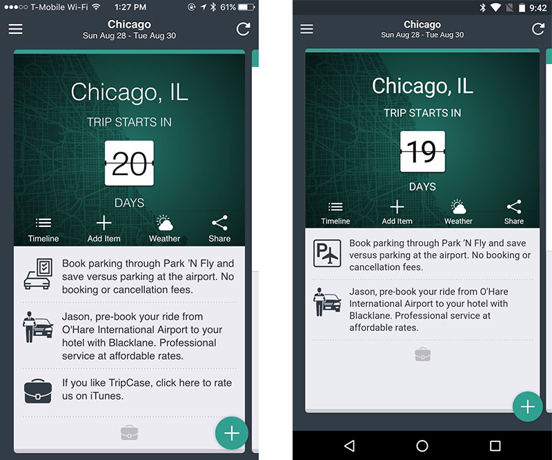
The app UI doesn’t necessarily fit the expectations for either platform. But the UI is similar enough to what people are used to that no one seems to get lost when using Tripcase.
Despite not “fitting in,” Tripcase has maintained a high rating on both iOS and Android app stores.Footnote 4
Which approach is best for Progressive Web Apps?
I don’t know that we can tell yet. Even the first option which didn’t work for PhoneGap apps, could work for Progressive Web Apps if we find that people’s expectations are different when adding to the home screen.
One thing that I am certain of is that tweaking the app to match the operating system shouldn’t be undertaken lightly. Not only does it means forking your app and maintaining those differences, but I’ve also seen companies enrage their customers when they tried to move from platform-specific designs to a uniform, cross-platform design. The backlash forced companies to throw away months of work and revert to the old designs.
If you give people an OS-specific version and then try to take it away, you’re going to upset people much more than if you never give them something OS-specific in the first place.Footnote 5
2. How do you manage going chromeless?
In an attempt to be more “app-like,” most Progressive Web Apps remove the browser chrome when they are added to the home screen. And in a controversial decision, the removal of the browser chrome is one of the things that Google looks for when deciding whether or not to display the app install banner.
Once the browser chrome is removed, you lose some of the features you get for free from the browser including the address bar, security indicators, forward and reload buttons.
When Progressive Web Apps come to iOS and other platforms that do not have an operating system level back buttonFootnote 6 , we’ll likely also lose the second most frequently used feature of the browser. It will be up to the developer to replace it.
This means managing the state of the app from both a design and development stand point. You have to know what someone was looking at previously and provide them with a way to go backwards.
This is likely something most responsive web designs haven’t had to worry about until now because the browser took care of it.
And as my co-founder Lyza pointed out a few years ago, even if you’re accustomed to managing state in JavaScript applications, managing them in a situation where you don’t have the browser as a safety net is another matter all together.
Things are trickier for Progressive Web Apps than PhoneGap apps. At least with PhoneGap, you know that the app is only going to be used without the browser chrome. A Progressive Web App may be used in the browser or launched from the home screen without any of the browser’s artifice.
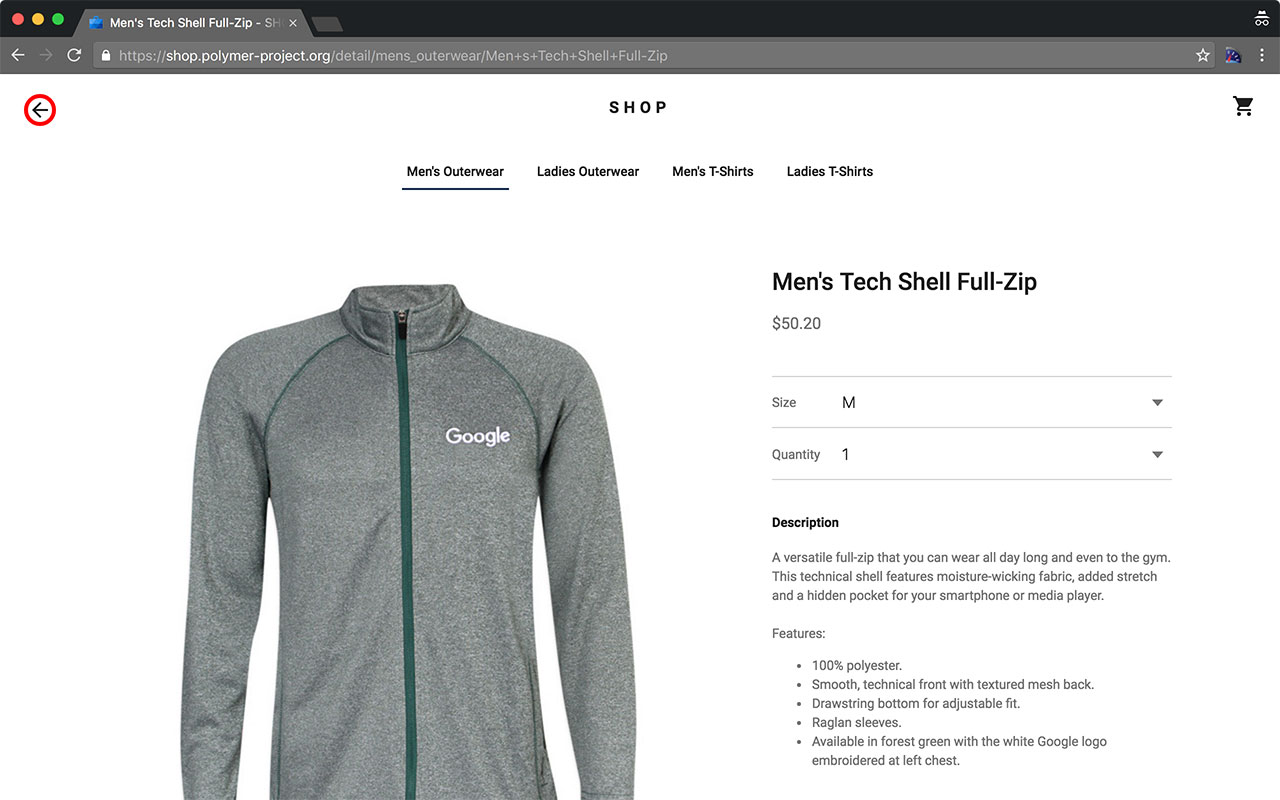
In the screenshot above, where should the in-page back button go?Footnote 7 There is no history. The user navigated directly to this page. Does that button even make sense in this context?
Display mode media queries
Thankfully, we do have some ability to test whether or not a Progressive Web App is being displayed inside browser chrome or not using display mode media queries. The W3C’s Web App Manifest standard defines the possible display modes.
With this new media query feature, we could use something like the css below to show the back button only when the app is being used without chrome:
.backButton {
  display: none;
}

@media (display-mode: standalone), (display-mode: fullscreen) {
  .backButton {
    display: block;
  }
}
Code language: CSS (css)
And you can also test the display mode in JavaScriptFootnote 8 :
if (window.matchMedia('(display-mode: standalone)').matches) {
  console.log('Thank you for installing our app!');
}
Code language: JavaScript (javascript)
Of course, these are new browser features and are only supported in Chrome, Opera and Firefox currently. As more browsers support Progressive Web Apps, you can bet that these media queries will also be supported.
State management is just the beginning
There are many implications of the fact that we cannot rely on the browser chrome to be present that will require us to change the way we design and build our apps.
For example, Owen Campbell-Moore points out that sharing can be more difficult in Progressive Web Apps:
PWAs are often shown in a context where the current URL isn’t easily accessible, so it is important to ensure the user can easily share what they’re currently looking at. Implement a share button that allows users to copy the URL to the clipboard, or share it with popular social networks.
The ability for someone to easily copy the URL is something we take for granted in the browser, but if we eliminate the browser chrome, we eliminate the address bar as well.Footnote 9
Other challenges include:
- The ability for people to follow links deep within a website versus the expected hierarchical flow of mobile apps.
- Accounting for
oauth, social logins, and other flows that might exit the Progressive Web App temporarily, but need to return to the app. - Apps being accessed by embedded webviews inside social apps or other non-browser web experiences.
It will take us some time to understand how to design Progressive Web Apps that feel natural and full-featured in all of the contexts in which they may be used.
3. What should be made into a Progressive Web App?
Your instinct may be to make everything on your site into a Progressive Web App. That was certainly my first thought as well. But that may not be the best solution.
On desktop, Facebook is a single app. On mobile, Facebook is several apps: Messenger, Groups, Pages, Moments, Ads, and of course, the main Facebook app itself.
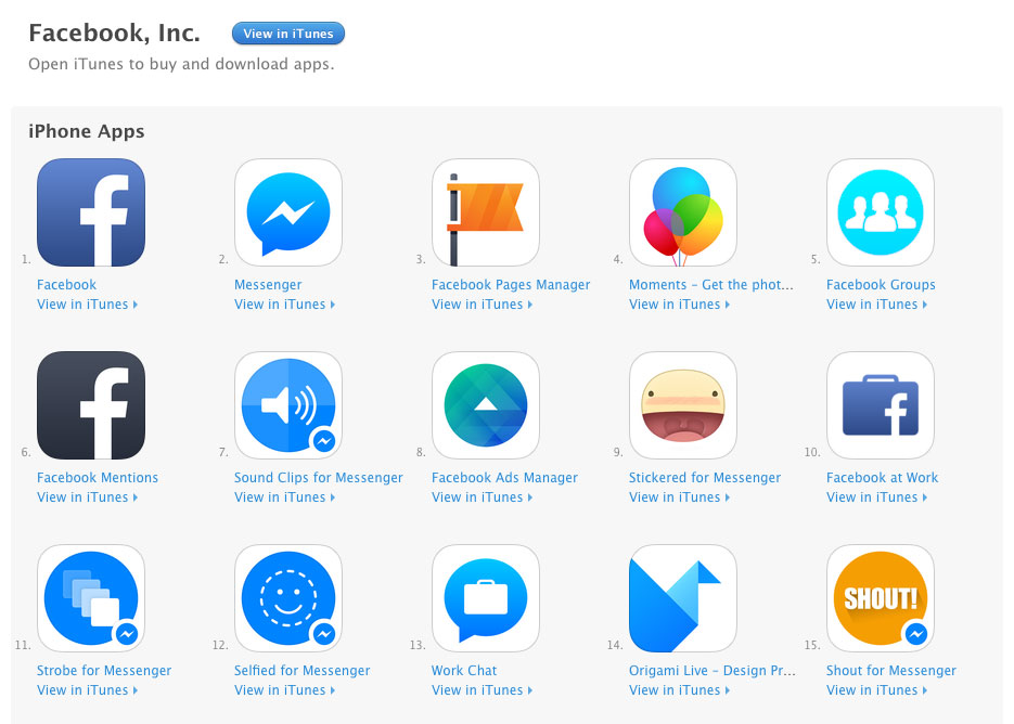
If Facebook made their website into a Progressive Web App, would it make sense to stick with the combined app experience of desktop, or should they break that desktop experience into multiple Progressive Web Apps like they did for their native apps?
Facebook isn’t the only company that will face this quandary when they decide to implement Progressive Web Apps. Many companies have multiple native apps that cover functionality that is under one tent on their website.
Here are some possible approaches that organizations can use to map their current website to Progressive Web Apps.
The whole site is a Progressive Web App
This makes the most sense for small sites or sites with one main purpose and similar content. Consider yourself lucky if this works for your site.
Different products equal different apps
This is the approach Facebook has taken where the different products that comprise the overall Facebook experience are broken out into separate apps on mobile.
The way Yahoo has organized their products might make Progressive Web App implementations easier for them than it will be for Facebook. Yahoo’s apps map directly to their menu structure:
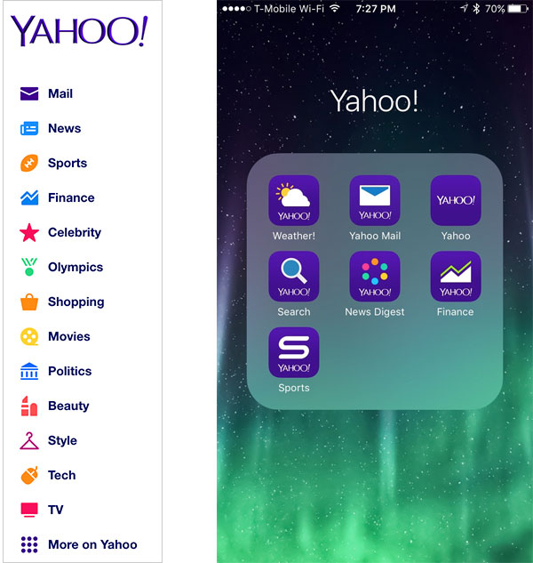
Each Yahoo product exists on their own subdomain. The navigation and features of each web product map almost directly to their native app counterpart.Footnote 10
Because of this, there is a clear path to be followed when Yahoo implements Progressive Web Apps. In fact, because each product is on its own subdomain, the browser’s app install banner prompt will make much more sense.
Tearaway apps
Sometimes it doesn’t make sense for the whole site to be an app. We see this in native apps when a company focuses on some specific task or activity as the full feature-set of their mobile app.
Nest is a good example. The Nest website contains marketing material, partner content, a store, support documentation, and a login area to manage your Nest devices.
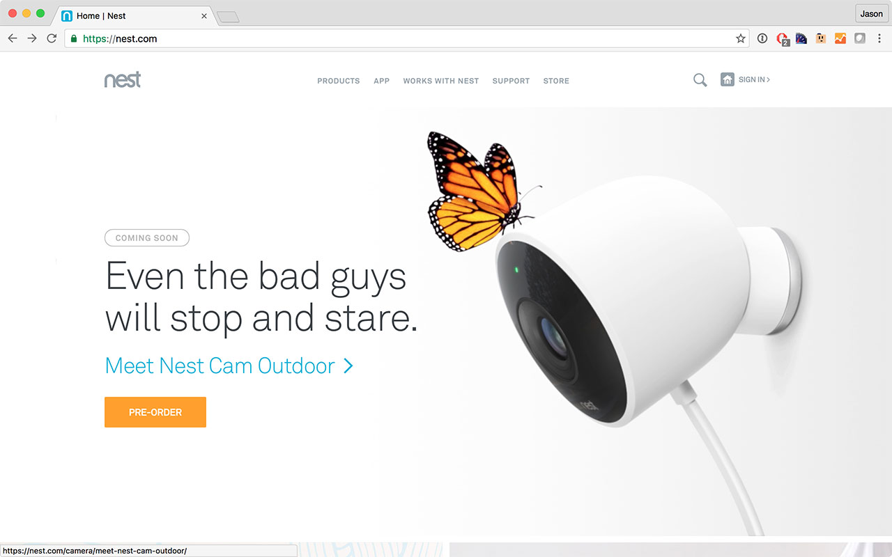
The native app focuses solely on managing your devices. It doesn’t have a store, partner content or support documentation.
The native app provides essentially the same experience one receives when they log into Nest’s desktop website.
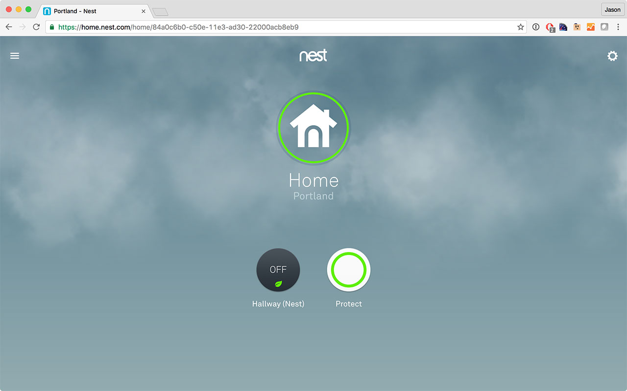
In fact, I’ve long suspected that the native app, which users seem to love, is simply a wrapper for their logged in experience.
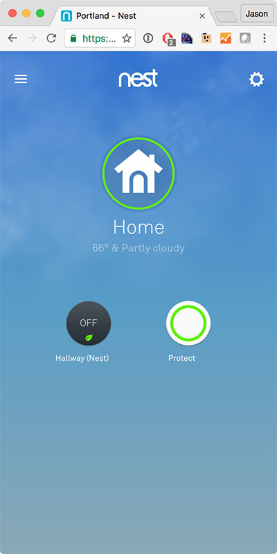
I’ve begun to think of apps like Nest as tearaway apps. For some websites, it doesn’t make sense for the full website to be a Progressive Web App. Instead, people will want to tear off a part of the experience to take with them as an app.
New UX challenges
These are just a few of the challenges that I see as we begin to design responsive Progressive Web Apps. There will likely be more.
When I look at these challenges, I see obstacles that can be bigger than those posed by the technology we typically think of as part of Progressive Web Apps. Implementing Service Workers on a given site could be a cakewalk compared to figuring out the proper way to handle state management.
And while these challenges are daunting, I’m personally excited by them because they live at the intersection of user experience and technology. To me, these are the most fun problems to solve.
The key unanswered question
The big question for Progressive Web Apps remains unanswered for now: what do users expect?
Will people expect an experience that maps to native conventions? Or will they be more accepting of deviation because they came to the app via the web and have already seen it before installing it?
My gut says that we can build great experiences without having to make it feel exactly like an iOS or Android app because people will have already experienced the Progressive Web App multiple times in the browser before they are asked to install it.
But we won’t truly know until we experiment and see how people respond.
Thanks to Owen Campbell-Moore, Alex Russell, Sara Lohr, Tyler Sticka, Gerardo Rodriguez, and Erik Jung for reviewing drafts of this article.
Footnotes
- Presumably native mobile app users. Return to the text before footnote 1
- In all seriousness, Owen’s article is a must read. There are some good recommendations in it as well as some thought-provoking ones that I agree with, but have no idea how to implement in a responsive design (e.g., “Content shouldn’t jump as the page loads”). Return to the text before footnote 2
- Read about Medium’s challenges trying to support system fonts and their follow-up article at Smashing Magazine. Return to the text before footnote 3
- Full disclosure: we helped with an early version of the Tripcase app. Return to the text before footnote 4
- Besides, nothing prevents you for tweaking the design to be operating system specific later if people complain. Return to the text before footnote 5
- Android provides a back button that is always available so this isn’t a problem on the only platform that currently supports Progressive Web Apps. There is no requirement that other platforms provide a back button. Return to the text before footnote 6
- The button goes to the Men’s Outerwear page. Return to the text before footnote 7
- Example code from Detecting if a Web App is Launched from the Home Screen. Return to the text before footnote 8
- Browser makers are experimenting with ways to make it possible to get to URLs from within Progressive Web Apps. Return to the text before footnote 9
- Yahoo has many more apps than the seven shown here. Not all of them map as well as these do. Return to the text before footnote 10
Jason Grigsby is one of the co-founders of Cloud Four, Mobile Portland and Responsive Field Day. He is the author of Progressive Web Apps from A Book Apart. Follow him at @grigs.

