The following is an exclusive extract from my new book, Jump Start Responsive Web Design, 2nd Edition. Copies are sold in stores worldwide, or you can buy it in ebook form here.
There are two main building blocks at the heart of responsive web design: media queries and viewports. In this post, we’ll take a look at media queries when building responsive sites.
Media queries represent the glue that joins a lot of other responsive concepts and tools together. They’re a simple but powerful concept, allowing you to detect device properties, define rules, and load different CSS properties based on them. For example, you can optimize a navigation menu for different devices, converting a full horizontal menu on desktop browsers to the “hamburger” menu often encountered on mobile devices.
Creating a Query
Let’s try a more substantial example. The aside to the main content in RWDflix is designed to show announcements and news. Mobile and tablet visitors probably want to focus on watching shows and nothing else, so let’s hide this element for users of smaller screened devices.
For the remainder of this chapter, I’ll use the @media method shown previously for media queries. It’s a personal preference, and as an experiment, you might like to try re-writing the examples using other methods.
Remove the current aside CSS class and replace it with the following media queries:
@media screen and (min-width: 680px) {
    aside {
        width: 33%;
    }
}

@media screen and (max-width: 680px) {
    aside {
        display: none;
    }
}
This pair of media queries sets the aside element to a width of 33% if the screen is wider than 680px (by asking if the screen is at least 680px wide with min-width), and hides it if the screen is narrower than 680px (asking if the screen is at most 680px wide with max-width).
Next, make the TV listings fill the screen width when the aside isn’t showing:
section.showslisting {
    margin-bottom: 25px;
}

@media screen and (min-width: 680px) {
    section.showslisting {
        width: 66%;
    }
}

@media screen and (max-width: 680px) {
    section.showslisting {
        width: 100%;
    }
}
If you resize the page in your desktop browser, you’ll see the aside appearing and disappearing as you widen and narrow the browser window, the main content adjusting appropriately.
You can use basic logic in your media queries. This allows you to combine multiple conditions. For example, you can use a logical AND:
@media only screen and (min-width: 640px) and (max-width: 1136px) {
    …
}
The code above will invoke the CSS styles within the query if a device’s screen width is between 640px and 1136px. The min-width property is the minimum width of the screen, and max-width the maximum.
For this media query to match, both conditions need to be true. It’s also possible to match queries if only one condition is true with a logical OR, which (confusingly) is represented with a comma. The query below will apply on screen or print devices:
@media only screen, print {
    …
}
You can also combine ANDs with ORs to make more complex queries. Here’s the current page rendered on a larger sized phone, but in landscape mode:
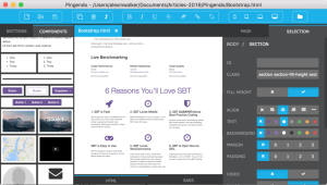
In the screenshot above, the screen is 732px wide, which is above the 640px set above. Still, the aside doesn’t quite fit into the window, so let’s hide it if the screen size is below 640px, or if the device is in landscape mode:
@media screen and (max-width: 680px), screen and (orientation: landscape) and (max-width: 750px) {
    aside {
        display: none;
    }
}
And the corresponding media query for the listings section:
@media screen and (max-width: 680px), screen and (orientation: landscape) and (max-width: 750px) {
    section.showslisting {
        width: 100%;
    }
}
You’ll see that I added a max-width check, to show the aside on tablets in landscape mode, but also to show how you can combine logical checks together.
Logical Queries with Only and Not
You can also make precise media queries using only and not. For example, this media query will match devices that are at least 640px wide and exclude the print media type:
@media not print and (min-width: 640px) {
    …
}
In contrast, this query will only apply to screen devices that are at least 640px wide:
@media only screen and (min-width: 640px) {
    …
}
Query Features
The width and height queries we’ve looked at so far are some of the most widely used, but there are several other media features that are also useful for checking against device features. These include color capabilities, aspect ratio, orientation, resolution, and vendor-specific features for Mozilla- and WebKit-based browsers. Most of these accept min- and max- prefixes that work in a similar way to the dimension queries above.
aspect-ratio
The aspect-ratio feature allows you to check the ratio of horizontal pixels to vertical pixels, separated by a slash. For example:
@media screen and (min-aspect-ratio: 1/1) {
    …
}
The above rule will match a device where the screen’s width to height ratio is 1:1 or more, so square or landscape.
A common use for this would be to detect wider screens, useful when you’re displaying videos:
@media screen and (min-aspect-ratio: 16/9) {
    …
}
orientation
As shown earlier, this feature checks if the device is in landscape or portrait mode. For example:
@media all and (orientation: landscape) {
    …
}
And:
@media all and (orientation: portrait) {
    …
}
color
This feature checks if a device can support a certain bit-level of color. For example, this is how to check that a device supports at least 8-bits of color (that is, 256 colors):
@media all and (min-color: 8) {
    …
}
color-index
This plays a role similar to color, but lets you check for the number of colors instead of the bit-level:
@media all and (min-color-index: 256) {
    …
}
monochrome
Again, similar to color, monochrome lets you check for the levels of gray in a device:
@media all and (min-monochrome: 8) {
    …
}
resolution
This feature targets devices that have high-resolution screens:
@media all and (min-resolution: 120dpi) {
    …
}
scan
The scan media feature lets you check the scanning process of TVs, the options being interlace or progressive:
@media all and (scan: progressive) {
    …
}
grid
grid is used for checking if a device is a terminal-like device. This also includes older phones (that is, non-smartphones), accessible phones (for those with poor vision), and braille devices. It returns a boolean value if true:
@media grid {
    …
}
As you can see, through combinations of dimension- and feature-based queries, you can construct complex stylesheets to target a multitude of devices effectively with styles that work most efficiently for them. This is the main point of media queries: they allow you to selectively load CSS styles for particular device configurations.
Streamlining the Example App
Now that you have a basic understanding, let’s continue to build upon the media queries added earlier to make the example site tidier.
First, you can consolidate the queries already written, moving the classes into two groups of media queries:
/* Media Queries */
/* For example, desktop devices */
@media screen and (min-width: 680px) {
    aside {
        width: 33%;
    }

    section.showslisting {
        width: 66%;
    }
}

/* For example, medium-width screens or smaller screens in landscape */
@media screen and (max-width: 680px), screen and (orientation: landscape) and (max-width: 750px) {
    aside {
        display: none;
    }

    section.showslisting {
        width: 100%;
    }
}
Much tidier! You can keep adding new styles for each query into these sections.
Let’s look back to our demo site specification outlined in Chapter 1 for what else needs to be optimized for each screen size. The next step will be hiding the TV show description on small screens, and shorten it on medium-sized screens.
It would be a lot easier to do this if the description text had a class, so add one to each instance of the p tag that contains the show description:
<section class="tvshow">
    <h3>Show</h3>
    <img src="http://placehold.it/350x150"
    class="thumbnail">
    <p class="showdescription">Lorem ipsum dolor sit amet,
    consectetur adipiscing elit.</p>
</section>
Let’s add new media queries to accommodate the various sizes we aim to support, and, in doing so, tidy up the existing ones.
The specific widths at which we want our design to reflow are known as breakpoints. The breakpoints we’ll add are not exhaustive: there’s a huge range of device sizes, and more are appearing all the time, so it’s futile to try to target each device with separate queries. A better approach is to assess the points at which your design needs to reflow, and then create media queries for those breakpoints. This is the beauty of responsive web design: you can ensure that each device will get an appropriate layout without having to design separately for each device.
Add the following breakpoints and refactor our existing styles into them:
/* Media Queries */

/* For example, older phones */
@media only screen and (min-width: 320px) {
    aside {
        display: none;
    }

    section.showslisting {
        width: 100%;
    }

    .showdescription {
        display: none;
    }
}

/* For example, newer phones */
@media only screen and (min-width: 480px) {
}

/* For example, small computer screens and larger tablets */
@media only screen and (min-width: 768px) {
    .showdescription {
        text-overflow: ellipsis;
        display: block;
        white-space: nowrap;
        width: 100px;
        overflow: hidden;
    }
}

/* For example, typical desktop monitors or larger tablet devices */
@media only screen and (min-width: 992px) {
    aside {
        width: 33%;
        display: block;
    }

    section.showslisting {
        width: 66%;
    }

    .showdescription {
        white-space: normal;
        width: 125px;
    }
}

/* Large Devices, for example large monitors and TVs */
@media only screen and (min-width: 1200px) {
}
The media queries should now be self-explanatory. They define queries for a selection of devices, defined using screen sizes. As the C in CSS implies, the media queries cascade: you can build upon styles defined in a breakpoint for a smaller device size and change the properties that are different.
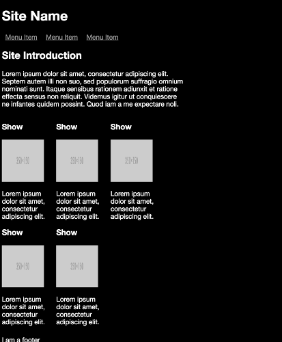
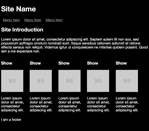
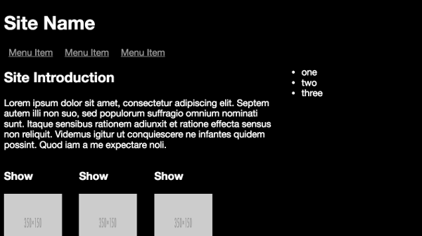
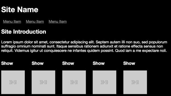
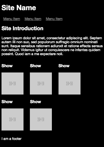
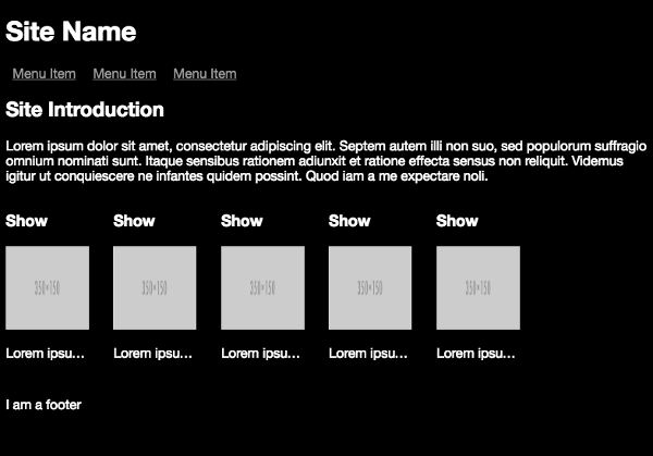
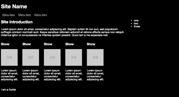
Notice that between the @media only screen and (min-width: 320px) breakpoint for smaller devices and the @media only screen and (min-width: 768px) breakpoint for medium-sized devices, all that changes is the showdescription class, showing text, but truncating it. Then in the @media only screen and (min-width: 992px) breakpoint for larger screens, all elements are revealed.
The layout generated by the small-screen breakpoint:
The layout generated by the medium breakpoint:
The layout generated by the medium to large breakpoint:
My recently released book Jump Start Responsive Web Design, is available now on SitePoint. It aims to get you started understanding, and using, the suite of CSS and HTML tools available for responding to this new world of devices. It’s highly practical, with plenty of examples throughout, covering:
- The Meaning and Purpose of Responsive Web Design
- The Building Blocks of Responsive Design
- Better Responsive Structures with Grid Systems
- Responsive Text
- Responsive Images and Video
- Responding to User Context
My book is suitable for for beginner-level designers and developers with understanding of HTML and CSS. Some JavaScript experience is useful for the later chapters.
Frequently Asked Questions (FAQs) about Creating Media Queries for Responsive Web Designs
What are the basic components of a media query?
A media query consists of a media type and at least one expression that limits the style sheets’ scope by using media features, such as width, height, and color. Media queries, added in CSS3, allow the presentation of content to be adapted to a specific range of output devices without changing the content itself.
How do I use media queries in CSS?
To use media queries in CSS, you need to define the media type (such as screen or print) and the conditions for applying specific CSS styles. For example, you can use the following code to apply styles for screens that are 800px or less:@media screen and (max-width: 800px) {
body {
background-color: lightblue;
}}
In this example, if the browser window is 800px or less, the background color will be light blue.
Can I use multiple media queries in a single style sheet?
Yes, you can use multiple media queries in a single style sheet. This allows you to apply different styles for different conditions. For example, you can have one set of styles for screens less than 800px wide, and another set for screens wider than that.
How can I test my media queries?
You can test your media queries by resizing your browser window to see if the styles change as expected. You can also use tools like Chrome’s DevTools to simulate different screen sizes and conditions.
What is the difference between min-width and max-width in media queries?
The min-width and max-width in media queries refer to the minimum and maximum width of the viewport, respectively. If you set a style with a min-width of 600px, that style will apply to any viewport that is 600px wide or wider. Conversely, if you set a style with a max-width of 600px, that style will apply to any viewport that is 600px wide or narrower.
Can I use media queries to target specific devices?
Yes, you can use media queries to target specific devices based on their characteristics, such as screen size, resolution, and orientation. However, it’s generally recommended to design for a range of device sizes rather than specific devices, as new devices with different sizes and characteristics are constantly being released.
What is the purpose of the ‘and’ keyword in media queries?
The ‘and’ keyword in media queries is used to combine multiple media features into a single query. This allows you to apply styles only when all the conditions are met. For example, you can use the following code to apply styles only for screens that are between 600px and 800px wide:@media screen and (min-width: 600px) and (max-width: 800px) {
body {
background-color: lightblue;
}}
Can I use media queries in HTML?
Yes, you can use media queries in HTML using the ‘media’ attribute in the ‘link’ element. This allows you to link to different style sheets for different conditions. However, it’s more common to use media queries in CSS.
What is the difference between ‘px’, ’em’, and ‘rem’ in media queries?
px’, ’em’, and ‘rem’ are units of measurement used in media queries. ‘px’ stands for pixels, ’em’ is relative to the font-size of the element, and ‘rem’ is relative to the font-size of the root element. The choice between them depends on your specific needs and the design of your website.
What is the ‘not’ keyword in media queries?
The ‘not’ keyword in media queries is used to apply styles when the conditions are not met. For example, you can use the following code to apply styles for screens that are not 600px wide:@media not screen and (width: 600px) {
body {
background-color: lightblue;
}}
In this example, if the browser window is not 600px wide, the background color will be light blue.
 Chris Ward
Developer Relations, Technical Writing and Editing, (Board) Game Design, Education, Explanation and always more to come. English/Australian living in Berlin, Herzlich Willkommen!