

Responsive design is a term we all should be familiar with by now but does the term accurately describe what we think it means? We’ve come to know “responsive design” to be the act of designing websites that display correctly on all devices and screen sizes. But some argue that “adaptive design” is a better name for this.
- Is this true, or are they the same thing?
- Or does “adaptive design” mean something else entirely?
- And where does “fluid design” fit into all this?
While this sounded like a fairly straight forward question, after a little investigation, I found it was more ambiguous than I might have guessed, and maybe even downright controversial.
There seem to be two competing definitions for adaptive:
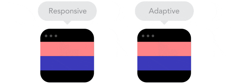
Definition 1: Responsive Design is a Selfie Stick – Adaptive Design is an Umbrella
In this definition, a responsively-designed product – just like the selfie stick – can be used in many states from fully extended, fully retracted and any of the points in-between. Sure, certain widths or breakpoints are more important than others, but every different width generates a slightly different layout.
Adaptive design behaves more like an umbrella. It has preset ‘states’ that it is designed to work at – open to stop rain, closed for transporting. The ‘in-between states’ are unimportant.

There are a number of GIF animations that illustrate this concept nicely.
In 2015, Geoff Graham outlined his view on the differences, saying that responsive layouts adapt to the browsers’ width at any given moment in time, whereas ‘adaptive layouts’ adapt to the browsers’ width only at specific breakpoints.
Geoff said that responsive design is based on percentages (i.e. the same thing as fluid design), and adaptive design is based on fixed units of measurements. Both are powered by CSS media queries.
Definition 2: Adaptive design responds itself to the entire device environment (not just the screen)
However, as you can see from the comments below Geoff’s article, not everyone agrees with this definition.
Here’s the top comment:
“Responsive design can be fluid or fixed, so can adaptive. The difference is that responsive design doesn’t care about what browser is used, it responds to the browser size and reflows the layout accordingly. On the other hand, adaptive design adapts to the browser environment specifically, and may or may not take into account the browser’s current size.” ⏤ zzzzBov.
By zzzzBov’s definition, Adaptive Design is JavaScript-driven and is as much about the reacting to the type of device as it about screen sizes. For instance, a tablet may have a high-resolution screen, yet it needs larger touch targets. A phone might need a different navigation system.
Many big names have weighed-in with their opinions, ranging from UXPin to Mozilla but it still appears to be unresolved.
Here’s My Take on the Matter
Let’s use an adjustable lamp as a real-world example: responsive design is when you flick the switch, and the lamp responds by turning on the light. Adaptive design is when you’re able to adjust/adapt the lamp so that you can see better.
If a website doesn’t respond to your interaction, it’s not very responsive, and if it isn’t able to adapt to its surroundings (i.e. the device screen), it’s not very adaptive. Both of these can significantly impact the UX.
Why Responsive Design Isn’t Responsive Design
A response is an action as a result of another action, for example, if a website button changes its background color when the user hovers over it — the action is the hover, and the response is the background color being changed.
Ordinarily, when we say that a website is responsive, we mean that it adapts to any screen size on any device, but in actuality, it should mean that it responds to user interaction. Here’s why:
A user cannot resize the browser on their mobile device. And while a user can change the browser size on a desktop computer, they don’t typically need to do that to interact with a website — it’s not a normal user interaction. Sure, us web designers often resize the browser to test a website, but it’s not a normal action for the user.
Why I Think “Adaptive Design” Is More Accurate
Since screen sizes are generally used in their default state (in the sense that you can’t or wouldn’t need to resize it), the term “adaptive design” might fit the bill more accurately. Websites (well-designed ones at least) will modify their layout to fit the device of the user; it’s an involuntarily action, meaning the user doesn’t have to interact with the website to make it adapt. Adaptive design could also describe how we optimize loading times and perceived performance for smaller, handheld devices.
So What’s Fluid Design Then?
Back in the early 2000’s, the big debate was ‘Fixed Layout vs. Fluid Layout’. Fluid design layouts were set with percentages, stretching to fit the frame of the browser. Fixed layouts were set at locked a single layout determined by a pixel width. Neither was ideal. Fixed layouts looked great on the right screen but were unusable on small monitors. Fluid layouts were more flexible but looked thin and stringy on wide screen monitors. Responsive Design was Ethan Marcotte’s direct response – no pun intended – to these design quandaries. Classic ‘stretchy’ RWD is like a mature, ‘grown-up’ version of fluid design – stretching to fill the window, but reorganizing itself when necessary. Geoff’s definition of adaptive design – though not agreed upon by many – is like a ‘grown-up version of fixed design’ – not a single fixed layout, but 3, 4 or more layouts.Conclusion
So there you have it, my take on responsive and adaptive design. After reading this article, will you change the way that talk about these terms, or is it easier to carry on talking about responsive design as a way to make websites adapt to multiple screen sizes?
Have you ever used the term “adaptive design” and received nothing more than a blank stare?
I’m curious, let me know in the comments below!
(No fighting please!).
Frequently Asked Questions (FAQs) on Adaptive Design vs Responsive Design
What is the main difference between adaptive design and responsive design?
The primary difference between adaptive and responsive design lies in their approach to user experience. Adaptive design uses static layouts based on breakpoints which don’t respond once they’re initially loaded. On the other hand, responsive design is fluid and adjusts with the browser width by using percentages as a measuring unit instead of pixels.
Is adaptive design better than responsive design?
The choice between adaptive and responsive design depends on the specific needs of a project. Adaptive design can provide a more tailored user experience as it allows for the creation of designs specifically for different devices. However, it requires more work as you need to create designs for each screen size. Responsive design, on the other hand, is more flexible and easier to implement, but it may not offer as tailored an experience as adaptive design.
How does adaptive design impact the loading speed of a website?
Adaptive design can potentially improve the loading speed of a website. This is because it only loads the necessary assets for the specific device being used, which can reduce the amount of data that needs to be downloaded.
What are the challenges in implementing adaptive design?
Implementing adaptive design can be more complex and time-consuming than responsive design. It requires a deep understanding of the different devices your audience uses and the creation of specific designs for each of these. This can increase the development time and cost.
Can adaptive design improve the user experience?
Yes, adaptive design can significantly improve the user experience. By creating designs tailored to specific devices, you can ensure that your content is displayed in the most optimal way for each device. This can lead to a more enjoyable and efficient user experience.
Is adaptive design suitable for all types of websites?
While adaptive design can be beneficial for many types of websites, it may not be the best choice for all. Websites that require a high level of customization for different devices can benefit from adaptive design. However, for simpler websites, responsive design may be a more cost-effective and efficient choice.
How does adaptive design affect SEO?
Adaptive design can have a positive impact on SEO. By providing a better user experience and faster loading times, it can improve your website’s ranking in search engine results. However, it’s important to ensure that all versions of your site have the same content and meta tags to avoid any potential SEO issues.
What skills are required to implement adaptive design?
Implementing adaptive design requires a strong understanding of web design principles, as well as knowledge of HTML, CSS, and JavaScript. It also requires the ability to design for different devices and screen sizes, and an understanding of how to optimize assets for different devices.
Can adaptive design be used in conjunction with responsive design?
Yes, adaptive and responsive design can be used together. This approach is known as “RESS” (Responsive Design with Server Side Components) and combines the flexibility of responsive design with the device-specific optimization of adaptive design.
What is the future of adaptive design?
As the number of different devices and screen sizes continues to grow, the need for adaptive design is likely to increase. However, as technologies evolve, new approaches to design that combine the best aspects of both adaptive and responsive design may emerge.
 Daniel Schwarz
Previously, design blog editor at Toptal and SitePoint. Now Daniel advocates for better UX design alongside industry leaders such as Adobe, InVision, Marvel, Wix, Net Magazine, LogRocket, CSS-Tricks, and more.