Building with Stencil: Calendar Component
Take a look at the month view of a calendar and you will see several rows of numbers. The numbers themselves, increasing in value one after the other, are arranged in columns. HTML and CSS provide us with a number of tools to display content in rows and columns. Making a calendar component should be easy, right? Right?

When we look at the first calendar day in a month, it could fall on any day of the week. This in turn can push the last day of the month to also fall on any day of the week. That variation can mean that there are six weeks (six rows) in some months, but only five weeks (rows) in others. Then of course there are the number of days in the month and oddities such as leap years.
When we turn to Stencil (and Web Components in general), all of these variations beg the question “What goes in my template if I do not know what I will need to display?” The answer is to figure out what you will need to display before you display it. We can leverage the Stencil component lifecycle to override componentWillRender() and perform the required calculations.
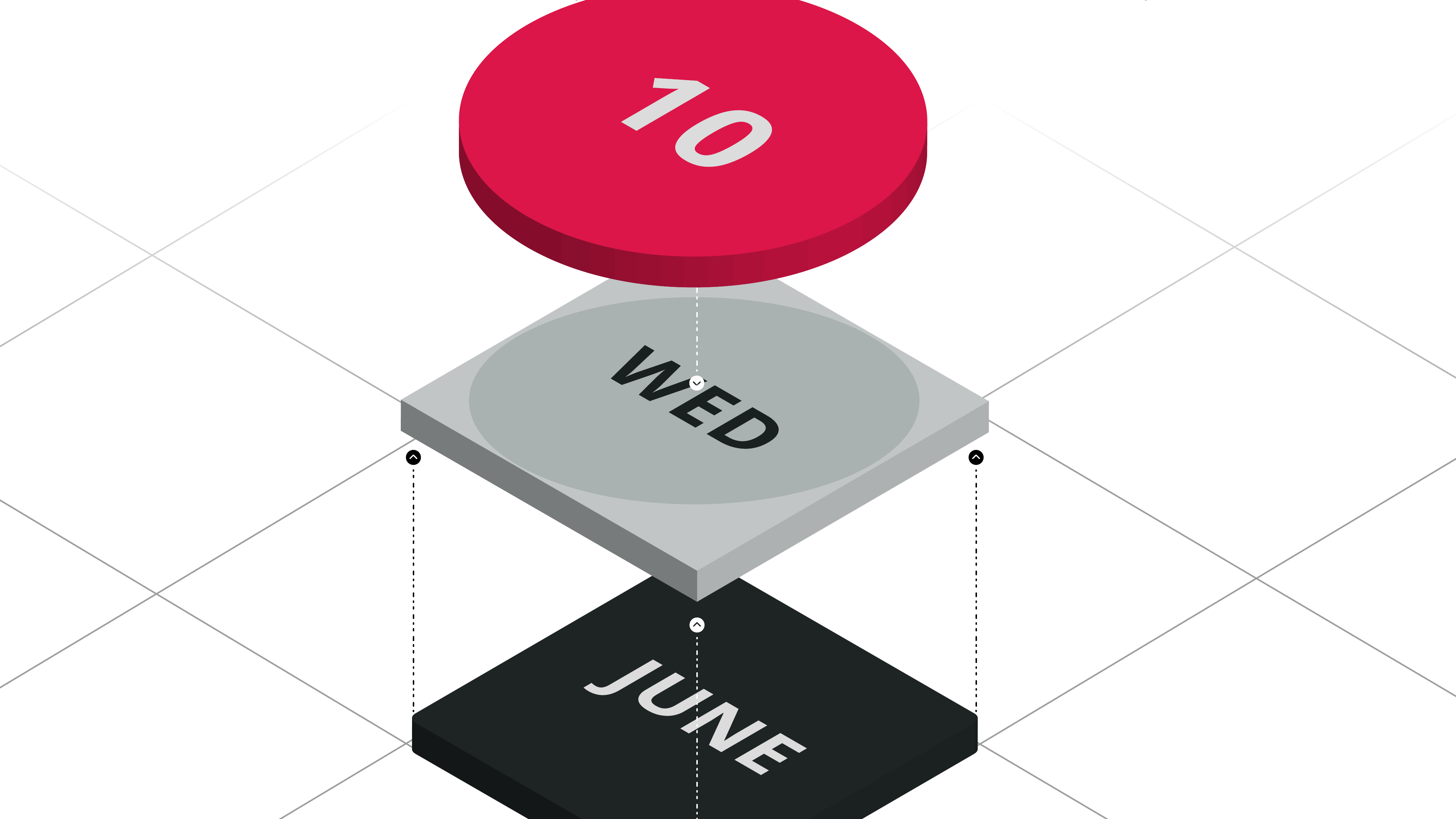
Building with Stencil: It is About Time!
If you think about any single given day on the calendar, you are really taking in several pieces of information at once. First is the integer representing the day of the month – and it is usually plastered in a giant font somewhere in each grid square. The second is that by the time you land on a day of the month, you likely already know the month and year. Finally, as your eyes rest upon a grid square, you are mentally selecting it, and know whether that selection represents today or not.
These implied and inferred pieces of information fall in no particular order, and any correlation is completely made up by me for the purposes of the flow of this blog post. 🤪
These are all important pieces of data we will need when rendering out each day in the calendar, so I like to have a class that represents them which I call Day. You might think “Why not just use the JavaScript Date class? The reason for this decision has to do with the selected and today properties that are boolean values used in helping render the appropriate styles on the calendar grid.
export default class Day {
  date: number = null;
  month: number = null;
  year: number = null;

  selected: boolean = false;
  today: boolean = false;
}
What Day Is It?
From a component perspective, there are a few properties we will need to consider. The first is the desired date to display in the calendar versus the date being displayed in the calendar. The desired date might also be considered the “value” of the calendar and is exposed as a property (@Prop()). The date displayed in the calendar is a matter of how the user has interacted with the component to change its state (@State()). We will also need an Array of Day as a component-internal property to hold the days associated with the rendering of the displayed date.
  @Prop( {mutable: true} ) value: Date = new Date();
  @State() displayedDate: Date = new Date();
  private days: Array<Day>;
For this calendar, when the user interacts with a day, that date will be set as the new value. Since value will be modified from inside the component, it will need to be marked as mutable. You may also want to emit an event that the value (selected date) has changed. Another consideration might be emitting an event for changes in the month being displayed.
Back to the Beginning
As we start implementing componentWillRender(), our first major task is to get back to the first day in the displayed month. The JavaScript Date constructor is perfectly suited for this by setting the third parameter, the day of the month, to one (1). The first day of the month does not mean you are at the first (upper-left) grid square, so we also need to go back in the calendar until we are on the first day of the week.
componentWillRender() {
  const today: Date = new Date();

  // Calendar used in iteration
  const calendar: Date = new Date(
    this.displayedDate.getFullYear(),
    this.displayedDate.getMonth(),
    1
  );

  // First day of month may not be first day of week
  // Roll back until first day of week
  calendar.setDate( calendar.getDate() - calendar.getDay() );

  // Clear days to be rendered
  this.days = [];

  // ... more ...
}
Perhaps not surprisingly, this now sets us up to iterate through the days of the month. Perhaps surprisingly, that is not what I like to do.
Building with Stencil One Day at a Time
My preferred approach for this iteration is to count to 42 (6 weeks possible x 7 days per week). If we make it through all 42 iterations, great. If we do not make it through all 42 iterations, we can break out of the loop at any time, and move on to the render. Additionally, it turns out that CSS Grid is perfectly suited for ending the iteration early, and will fill in the “gaps” for us.
Though I have seen various takes on how to manage the iteration through the calendar, this “count to 42” approach leads to the most readable version that I have found. YMMV.
componentWillRender() {
  const today: Date = new Date();

  // Calendar used in iteration
  const calendar: Date = new Date(
    this.displayedDate.getFullYear(),
    this.displayedDate.getMonth(),
    1
  );

  // First day of month may not be first day of week
  // Roll back until first day of week
  calendar.setDate( calendar.getDate() - calendar.getDay() );

  // Clear days to be rendered
  this.days = [];

  for( let d: number = 0; d < 42; d++ ) {
    // Day to be rendered
    // Seed with current date in iteration
    const day: Day = new Day();
    day.year = calendar.getFullYear();
    day.month = calendar.getMonth();

    // Populate day in month
    // Undefined date properties are not rendered
    if(
      calendar.getFullYear() === this.displayedDate.getFullYear() &&
      calendar.getMonth() === this.displayedDate.getMonth()
    ) day.date = calendar.getDate();

    // Check for today
    if(
      calendar.getFullYear() === today.getFullYear() &&
      calendar.getMonth() === today.getMonth() &&
      calendar.getDate() === today.getDate()
    ) day.today = true;

    // Check for selection
    if(
      calendar.getFullYear() === this.value.getFullYear() &&
      calendar.getMonth() === this.value.getMonth() &&
      calendar.getDate() === this.value.getDate() &&
      calendar.getMonth() === this.value.getMonth()
    ) day.selected = true;

    // Add to days to be rendered
    this.days.push( day );

    // Keep rolling
    calendar.setDate( calendar.getDate() + 1 );

    // Do not render the last week
    // Depending on calendar layout
    // Some months require five weeks
    // Others six weeks (see May 2021)
    if(
      calendar.getDay() === 0 &&
      calendar.getMonth() !== this.displayedDate.getMonth()
    ) break;
  }
}
Within each iteration, we seed the Day instance with the month and year, but not necessarily the day of the month. We can use this absence of data in the render. We also check to see if the date in the current iteration is today, or if it matches the value property. These flags will help us style the calendar appropriately. If we pass the end of the month being displayed, we are done and can return to the component lifecycle to actually render the calendar.
Once More, With Feeling
When it comes to the actual rendering of the calendar, I like to separate it semantically from the rest of the calendar. This helps keep the CSS more concise.
The most interesting part of the CSS is the use of CSS Grid. The grid-template-rows property is specified as repeat( auto-fill, 1fr ) which is what allows us to get away without having to complete the week at the end of the month, or outright leave a week off the end of the month if there are only five (5) weeks.
article {
  box-sizing: border-box;
  display: grid;
  grid-template-columns: 1fr 1fr 1fr 1fr 1fr 1fr 1fr;
  grid-template-rows: repeat( auto-fill, 1fr );
  gap: 0px 0px;
  min-width: 100vw;
  padding: 0 4px 4px 4px;
}

article button {
  appearance: none;
  -webkit-appearance: none;
  background: none;
  border: none;
  box-sizing: border-box;
  cursor: pointer;
  font-family: -apple-system, sans-serif;
  font-size: 20px;
  margin: 3px;
  min-height: calc( ( 100vw / 7 ) - 6px );
  outline: none;
  padding: 0;
  -webkit-tap-highlight-color: rgba( 0, 0, 0, 0 );
  text-align: center;
}

article button[disabled] {
  cursor: default;
}

article button.selected {
  background-color: rgba( 255, 0, 0, 0.10 );
  border-radius: 100%;
  color: #ff0000;
  font-weight: 600;
}

article button.today {
  color: #ff0000;
}

article button.selected.today {
  background-color: #ff0000;
  color: #ffffff;
}
As you can probably tell from the CSS, each day in the month will be rendered as a button element. On that button element, we can use data attributes to store the day, month, and year that each represents. In the click handler, a reference to the button can be obtained using the target property of the MouseEvent. These values can then be parsed, and a Date object is then created to represent the date that was selected. This keeps us from having to store DOM references to each of the days being rendered. A button marked disabled will not fire the click handler.
<article>
  {this.days.map( ( day: Day ) =>
    <button
      class={{
        selected: day.selected,
        today: day.today
      }}
      data-date={day.date}
      data-month={day.month}
      data-year={day.year}
      disabled={day.date === null ? true : false}
      onClick={( evt: MouseEvent ) => this.doSelect( evt )}>
      {day.date}
    </button>
  ) }
</article>
I call this whole technique of calculating what needs to be displayed before the actual rendering process “pre-rendering”. The approach is valuable not only in calendars but also in any situation where there can be a variable number of elements to be rendered. Dynamic SVG content is another place where this technique comes in handy.

Modern calendar designs do not show the dates for the days outside of the month being rendered. This holds true for both Material Design and Apple Human Interface Guidelines. You can alter the pre-rendering to meet your requirements should they differ.
Could you forego the pre-rendering, and do all the calculations in the render proper? With enough braces, brackets, and parenthesis, you probably could. This approach however gives us a clean separation between the data to be rendered and the render itself leading to readable and maintainable code.
Next Steps
A number of nuances to calendar rendering have not been addressed in this article. For example, Sunday is not always the first day of the week depending on your locale. More could also be done to address accessibility. And of course, changing the styles for different mobile operating systems would take considerable effort. Does this sound like a lot more work? Yes! Ionic Framework can help. The announced Ionic Framework v6 includes modern calendars built to conform to the latest design guidelines, including accessibility.
Check out the live demo and get the complete code.
Come meet the Stencil team and hear what we’re working on for future releases! The Stencil Team is hosting Office Hours Wednesday, August 11th at 12pm CDT and sharing their plans for the future. Can’t make the office hours in person? Ask your question ahead of time and we’ll answer it live.