Do you ever open the app and cannot read the full text because it's cut off in some way? This scenario became frequent to me once I increased the font size on my phone. Technology agency from the Netherlands, Q42, carried out extensive research on 1.5 million iOS users and found that as many as 33% of people change the text size on their phone, and increasing text size is more common than making the text size smaller (20% increasing vs 13% decreasing). With such a large percentage, it is reasonable to assume that Android users likely also change these settings in similar frequency.
That is a big group of people, which makes it really important to consider how this setting will be supported when developing and testing your apps.
Common issues and solutions
I have been using various apps on my phone with non-default text and density settings. Reducing font size rarely causes any issues. However, even slightly larger than the default font size often means that a lot of issues appear. The following problems are the most common and often easily fixed.
1. Text does not scale
In some apps, after changing the font size, the text does not scale up at all. This is the number one issue on the list. While the layout is displayed correctly and text is visible, the user is not able to gain any benefit from the device setting and, as such, will struggle with reading the text.
Most of the time this is caused by using dp for text sizing instead of sp. dp, density-independent pixels, are used for displaying consistently sized user interface across any screen size. sp, scalable pixels, have the same default value as dp. However, sp changes with the user's font preference and dp does not. This means sp should be used for text elements so the size of the text will increase or decrease with the device setting.
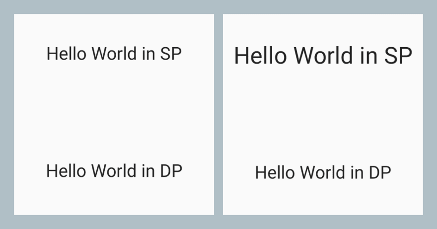
In this screenshot, you can see how the text defined in dp remains the same size regardless of the user's font preference.
In other cases, the text does not scale because it is part of the image, instead of TextView. Providing content description is important for these scenarios, however just providing content description is not enough for an accessible solution. Not every user with vision issues is using Talkback: a better approach is using TextView over the image, as then the text size can still be increased.
Lastly, autosizing TextViews can also cause the issue of the text not scaling in an expected way. This solution ensures that the text fits inside the view nicely and layouts do not break, but this doesn't always provide a benefit if the user is not able to easily read the text at that size. The limits need to be set carefully and testing with different font and density combinations will help to spot issues when using autosizing.
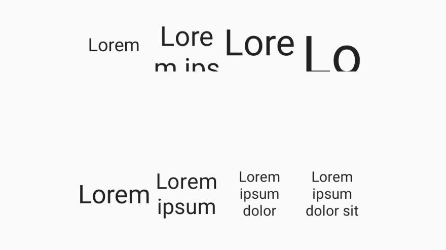
In the screenshot, the top TextViews do not use autosizing, meaning the text does not fit as it grows longer and the font size is increased. With autosizing, the issue appears to be fixed, as all the text is visible. However, it is not a full solution, as while the text is now visible it is very small. In this case there is no easy fix in the code, and the design should be reimagined to support longer text better.
2. Text is cut off
In this scenario the text is cut-off in some way. Often half a line or the end of the text is missing. This usually indicates an issue with the layout constraints.
To resolve this, prefer wrap_content and minHeight/Width over hardcoding layout limits. This allows the content to scale to different lengths and sizes. When using constraint layout, make sure to set start AND end constraints, so the view does not end up out of visible screen space.
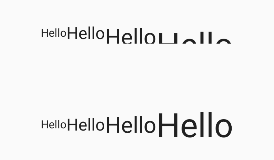
In this screenshot, TextView height is constrained, so when the text grows beyond the height, it gets unreadable. In the code below, adding the minHeight attribute instead of fixed height allows the field to grow and remain usable.
<TextView
            android:layout_width="wrap_content"
            android:layout_height="32dp"
            android:text="Hello"
            android:textSize="48sp" />

<TextView
            android:layout_width="wrap_content"
            android:layout_height="wrap_content"
            android:minHeight="32dp"
            android:text="Hello"
            android:textSize="48sp" />
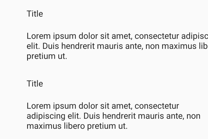
In this screenshot, the text has grown beyond the boundary of the screen. This can easily happen if the content is coming from the API and is longer than it was initially expected to be, especially with increased font size. Where no issues would happen in the following code example with short text, it's important to think about having constraints at both sides of the elements to avoid issues when the text length changes.
    <TextView
        android:id="@+id/title"
        android:layout_width="wrap_content"
        android:layout_height="wrap_content"
        android:layout_marginStart="40dp"
        android:text="Title" />

    <TextView
        android:layout_width="wrap_content"
        android:layout_height="0dp"
        android:text="@string/long_text"
        app:layout_constraintStart_toStartOf="@+id/title"
        app:layout_constraintTop_toBottomOf="@+id/title" />
Adding a constraint for the end as well fixes this issue and all text remains visible.
    <TextView
        android:layout_width="0dp"
        android:layout_height="0dp"
        android:text="@string/long_text"
        app:layout_constraintEnd_toEndOf="@id/title"
        app:layout_constraintStart_toStartOf="@+id/title"
        app:layout_constraintTop_toBottomOf="@+id/title" />
3. Text overlays other elements
In some cases, the views overlay each other. This causes unreadable screens, especially if several text views end up on top of each other. It can be caused by badly defined constraints. For example, an icon starts overlaying the text as the text becomes longer through the font sizing. This problem can also often be seen with translated text when some languages use much longer text than the one for which the app was designed in.
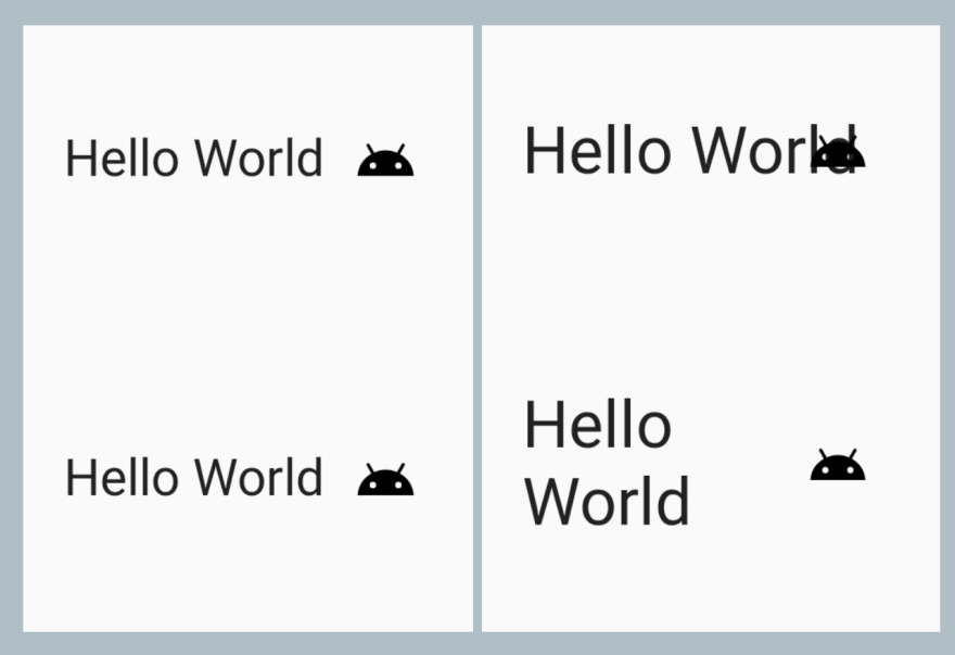
In the screenshot, TextView is not constrained at the end and grows to overlay the icon. This makes it hard to read the text and to see what the icon is to get more context.
    <TextView
        android:layout_width="wrap_content"
        android:layout_height="wrap_content"
        android:text="Hello World"
        android:textSize="20sp"
        app:layout_constraintStart_toStartOf="parent" />

    <ImageView
        android:layout_width="wrap_content"
        android:src="@drawable/ic_android"
        app:layout_constraintEnd_toEndOf="parent"
        android:layout_height="wrap_content"/>
To fix this, TextView is constrained against the icon, so the elements cannot end up on top of each other.
    <TextView
        android:layout_width="0dp"
        android:layout_height="wrap_content"
        android:text="Hello World"
        android:textSize="20sp"
        app:layout_constraintStart_toStartOf="parent"
        app:layout_constraintEnd_toStartOf="@+id/image" />
4. Unusable ellipsizing
Another common issue is when the text scales or when the content is longer than planned for and it becomes ellipsized. Ellipsizing by itself is not an issue, it is a great technique to use in some scenarios. For example, if the user is looking at a preview of an article and can click through to the details to read more. However, the information can be easily lost in snackbars, titles, or error messages, especially if there is something crucial at the end.

There are various ways to fix this; one method is that the views could be set to allow multiple lines if the text can potentially expand over the limit. It is also helpful to think about whether the content needs to be fully visible to the user on their current screen (text in the article, error message) or whether it could be ellipsized and still make sense without the full text (clickable title in a list which links to detail).
How to test
There are a few ways to test and catch most of these scenarios.
Android Studio
When editing a layout in Android Studio, the layout can be previewed in different devices, which helps to catch issues with smaller screen sizes.
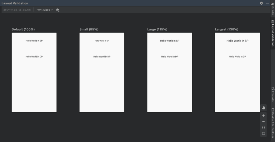
Android Studio also includes the Layout Validation tool which can show a preview with different font sizes.
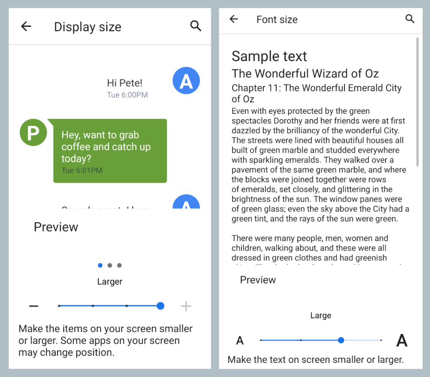
Device testing
Manual testing on a device or an emulator helps to catch issues as well. Often, a small set of emulators is enough, as the device settings can be used to test different configurations. My approach is modifying the font size first and then the display size.
To sum up
- Plan for flexible layouts and consider what happens when text expands beyond the default size.
- Test with different font and display sizes to find issues with scaling.
- We (mostly) don't build the apps just for ourselves: usability is important.
I hope this article gave you some tools to make your apps better. Code examples in the article have been shortened to only show the important lines of code. A Github repository containing the full sample code used for examples and generating screenshots is available here.


Top comments (0)